Learning Outcomes
On commpletion of this page you will know to use CSS in order to:
- move images in a linear fashion, rotate and scale them
- use keyframes to apply a series of different animations
- create a carousel
On commpletion of this page you will know to use CSS in order to:
Images such as .jpg or .png files are normally static components on a web page. Motion is normally confined to .gif files or else to video files such as .mov, .WebM, .ogg, .wmv, .mp4, .mpg etc. It is possible, however, to apply limited animation to .jpg or .png images. Some animations can be spectacularly impressive but ultimately useless, but controlled animations can be useful for attracting the user's attention.
Here we shall introduce a small variety of possible animations.
Go to topListing 1 below shows an extremely simple piece of HTML code, whose sole function is to display an image of Auckland city.
                        <html>
                            <head>
                                <link href="Translations.css" rel="stylesheet" type="text/css">
                            </head>
                            <body>
                                <main>
                                    <article>
                                        <h1>Auckland Panorama</h1>
                                        <p></p>
                                        <img src="Auckland.jpg" alt="">
                                    </article>
                                </main>
                            </body>
                        </html>
It contains all of the recommended tags that constitutes a well structured page, but has only one article block, inside of which the image is displayed.
Below is the CSS code to style the page.
                        img{
                            width:200px;
                            transition: 3s;
                            display:block;
                            margin:0 auto 0 auto;
                        }
                        img:hover{
                            transform:translate(200px);
                        }
                        img:active{
                            transform:translate(200px, 100px);
                        }
                        main{
                            width:750px;
                            height:250px
                            margin:0 auto 0 auto;
                            background-color:#444;
                            padding:20PX;
                        }
                        h1{text-align: center;
                            color: #ff0;
                        }
All of the code in Listing 2 should be familiar to you apart from line3 and lines 7 - 12.
Line 3 uses the transition attribute to specify that whatever animation effects we apply to the image will take 3 seconds to complete.
At line 7 we use the hover pseudo-class to control our animation. By merely hovering over the image we can apply the animation to it.
What animation are we applying? The animation specified in line 8.
Here we meet the transform property. In this case it has one function attached to it - the translate() function.
The function, translate(), as specified at line 8, has a single parameter: 400px. This will cause the image to move 400 pixels to the right.
The image will remain in this position as long as the mouse is left hovering over the image. As soon as it is removed the image glides back to its original position - again taking 3 seconds to do so.
The distance travelled by the image can be shortened or lengthened by decreasing and increasing the value of the parameter passed to the function translate(). Similarly the length of time it takes for the image to complete its movement can be altered by changing the value of the attribute transition.
The active pseudo-class applies to when you press the mouse button down on an object and hold it there. Once the mouse button is released active is disabled
We meet this pseudo-class at line 10 of Listing 2. Here we are presented with a variation of the translate function. This time it has two parameters
The first parameter, 400px, moves the image 400 pixels along the x-axis, while the second parameter moves the image 500 pixels along the y-axis.
We might expect that this would give us two animations: a horizontal movement followed by a vertical movement. Instead we get a single diagonal movement.
We have seen scaling in the first example above. However as scaling can be quite useful in certain situations we are giving it a section for itself here.
                        <html>
                            <head>
                                <link rel="stylesheet" href="Scale.css">
                            </head>
                            <body>
                                <main>
                                    <article>
                                        <h3></h3>
                                        <img src="Wellington.jpg" alt="">
                                    </article>
                                </main>
                            </body>
                        </html>
The code above is almost identical to Listing 1, apart from line 9 where we are using a different image.
                        img{
                            width:200px;
                            transition: 3s;
                            display:block;
                            margin:0 auto 0 auto;
                        }
                        img:hover{
                            transform:scale(2);
                        }
                        img:active{
                            transform: scale(.5, 2)
                        }
                        main{
                            width:750px;
                            margin:0 auto 0 auto;
                            background-color:#444;
                            padding:70px 0 0 0;
                            height:250px
                        }
The code above is almost identical to Listing 2; the only difference is that we are using the scale function.
The hover pseudo-class spans lines 7 - 9. Here the scale() function has a parameter of 2. This will cause the width and height of the image to increase by a factor of 2, in other words increasing the area of the image by 4.
The active pseudo-class spans lines 10 - 12. This time the scale function produces a more dramatic effect; it reduces the width to 50% of the original and increases the height by a factro of 2.
Used carefully the ability to scale images may be useful to people with low vision. Of course it should be scaled equally in both direction for this purose
Go to topAs the name implies rotation means spinning objects around a point. The point may be inside the object, on its periphery or external to it. In our examples here we shall be spinning the objects around their centres.
                        <html>
                            <head>
                                <link href="Rotations.css" rel="stylesheet" type="text/css">
                            </head>
                            <body>
                                <main>
                                    <article>
                                        <h1>St Matthews</h1>
                                        <p></p>
                                        <img src="StMatthews.jpg" alt="">
                                    </article>
                                </main>
                            </body>
                        </html>
As with all other cases the code above needs no explanation.
                        img{
                            width:300px;
                            transition: 3s;
                            display:block;
                            margin:0 auto 0 auto;
                        }
                        img:hover{
                            transform: rotate(360deg);
                        }
                        img:active{
                            transform: rotate(-720deg);
                        }
                        main{
                            width:750px;
                            margin:0 auto 0 auto;
                            background-color:#444;
                            padding:20px;
                            height: 350px;
                        }
                        h1{text-align: center;
                            color: #ff0;
                        }
With the hover pseudo-class at line 8 above the image rotates 360 degrees clockwise while the active class at line 11 causes it to rotate 720 degrees anti-clockwise.
Hidden expansion is slightly similar to scaling; it increases the size of the image. The difference however is that you don't see the outer areas of the expanded image. It is similar to zooming in on an image. You see the area zoomed in on but you can no longer see the peripheral areas.
                        <html>
                            <head>
                                <link rel="stylesheet" href="Hidden_Expansion.css">
                            </head>
                            <body>
                                <header>
                                </header>
                                <main>
                                    <article>
                                        <figure style="width:300px; height:200px;overflow:hidden;margin:0 auto 0 auto;">
                                            <img src="Christchurch.jpg" alt="">
                                        </figure>
                                    </article>
                                </main>
                                <footer>
                                </footer>
                            </body>
                        </html>
When you want to scale an image to focus on the centre the simplest way to do so is to wrap a container around the image and set the overflow property of the container to hidden.
You must also ensure that the container's width and height is exactly the same as the image's.
In listing 5 above we are wrapping a <figure> object around the image. We set its width and height properties to that of the image and set its overflow property to hidden
The result of this is that when the image is scaled the overflow beyond the borders of the <figure> will not be visible.
                        img{
                            width:300px;
                            transition: 3s;
                            display:block;
                            margin:0 auto 0 auto;
                        }
                        img:hover{
                            transform: scale(2);
                        }
                        main{
                            width:750px;
                            margin:0 auto 0 auto;
                            background-color:#444;
                            padding:20PX;
                        }
If you are familiar with geometry then skewing can be defined as changing a rectangle into a parallelogram without altering the height. Fig 1 below shows a graphic representation of that.
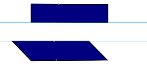
The above image is an example of skewing. At the top is the original rectangle and the image at the bottom is the first one where the top line has been pulled to the left. Both shapes are of the same height as is evidenced by the parallel lines.
Skewing can be applied to images as shown above. It can also be applied to text and text containers. For our first example we shall skew an image and for our second, and main, example we shall do a more spectacular version where we shall skew text paragraphs.
We shall first start with the simple example.
                        <!DOCTYPE html>
                        <html lang="en">
                            <head>
                                <link href="SkewingRectangle.css" rel="stylesheet" type="text/css">
                            </head>
                            <body>
                                <main>
                                   <article>
                                       <img src="BlueRectangle.png" alt="">
                                    </article>
                                </main>
                                <footer>
                                </footer>
                            </body>
                        </html>
Again in Listing 8 we have an extremely simple HTML code which only presents a single file - "BlueRectangle.png".
Styling for this image and the containing page is in "SkewingRectangle.css", the code of which is shown below.
                         html{
                             background-color: #444;
                             font-size: 100%;
                         }
                         main{
                             width:800px;
                             margin: 0 auto;
                             background-color: beige;
                             padding: 60px;
                         }
                         h1{
                             font-size: 2rem;
                             text-align: center;
                         }
                         img{
                             margin: 0 auto;
                             display: block;
                             transition: 3s;
                         }
                         img:hover{
                             transform:  skewX(30deg);
                         }
There is not much to explain in this code section either. The only thing new is lines 20 and 21. The result is that if you hover over the image "BlueRectangle.png" it will skew left by 30 degrees - something you can try out in Iframe 5 below.
So far we have worked with transforming the shapes and locations of images. As stated earlier on this page, we can also apply the same transformation to text containers. For our next example we shall use the skew() function to create a concertina effect.
                        <!DOCTYPE html>
                        <html lang="en">
                            <head>
                                <link href="Skewing.css" rel="stylesheet" type="text/css">
                            </head>
                            <body>
                                <main>
                                   <article>
                                       <h1>Things to do in Auckland</h1>
                                       <p>Go to the top of Sky Tower</p>
                                       <p>Attend a classical concert at the Town Hall</p>
                                       <p>Go to a rock concert at the Powerstation</p>
                                       <p>Take a ferry to Devonport</p>
                                       <p>Visit Kelly Tarleton's Seaworld</p>
                                       <p>See an opera at the Aotea Centre</p>
                                       <p>Watch a play at the Waterfront Theatre</p>
                                       <p>Stroll around the Wynyard Quarter</p>
                                       <p>Spend a day on Waiheke Island</p>
                                    </article>
                                </main>
                                <footer>
                                </footer>
                            </body>
                        </html>
The above block of code could have been the starting point of a website to give information about things to do in Auckland. It could belong to any organisation that deals with visitors coming to Auckland, from the top range hotels to the humble bed and breakfasts and from chauffer drive limousines to the AT buses and trains.
At first glance it looks boring and not very good at catching the eye of anyone. We need to spruce it up into something colourful, brash and attention grabbing. Welcome to skewing again.
Below we look at the CSS code.
Download Program Code
                        html{
                            background-color: #444;
                            font-size: 100%;
                        }
                        main{
                            width:800px;
                            margin: 0 auto;
                            background-color: beige;
                            padding: 60px;
                        }
                        h1{
                            font-size: 2rem;
                            text-align: center;
                        }
                        p{
                            width: 80%;
                            padding: 12px;
                            margin: 0 auto;
                            font-size: 1.5rem;
                            font-weight: bold;
                            text-align: center;
                        }
This code is divided into two blocks for convenience sake.
                        p:nth-child(2n+1){
                             background-color:#0ff;
                             color: #000;
                             transform:  skew(30deg);
                        }
                        p:nth-child(2n){
                             background-color:#009;
                             color:#fff;
                             transform:  skew(-30deg)
                        }
Here we are using the pseudo classes nth-child(2n+1) and nth-child(2n). Those pseudo classes are more thoroughly explained in the page Counters on this site.
Lines 23 - 26 format the odd numbered paragraphs to light blue with black text and skewed right.
Lines 28 - 32 format the even numbered paragraphs to dark blue with white text and skewed to the left.
When the page is opened this display should look like Fig 2 below.
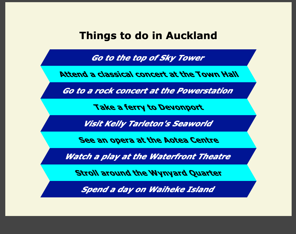
The result is eye catching and colourful. No doubt about it; it is difficult to move past this without noticing it. However it is somewhat uncomfortable to read even by someone with no visual or learning impairments. The main cause of this is the fact that the text is either italicised to the right in the odd paragraphs and to the left in even paragraphs.
For dyslexics who get confused by regular italicising this could be a nightmarish experiences. For this reason, if such styling is used then another version with exactly the same information should be provided. Also clear instructions should be given to the viewer on how to access the alternative version.
Go to topImages are a great facility for adding extra meaning to a piece of text. They also help to break up the text into less intimidating chunks for those with cognitive impairments. Unfortunately they also take up a lot of screen space.
Here we introduce a nifty CSS trick where we can get three images into the same space as one without having to reduce them in size.
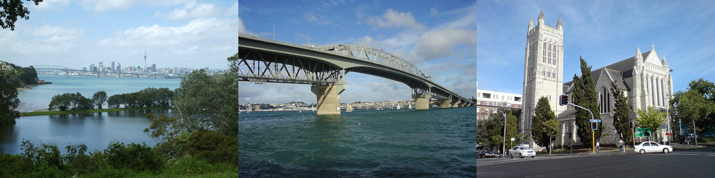
Above we have a very long image which is made up of three images that are each 480 pixels wide and 360 pixels high. Therefore the entire composite image is 1440 pixels wide.
We shall place this image into a figure container which is 480 pixels wide and 360 pixels high. Only one third of our image can be seen in the container. To see the other two thirds we shall use the hover and active pseudo-classes to allow us to look at each of the two other thirds.
The HTML code is below.
                        <html>
                            <head>
                                <title>CSS|triple image</title>
                                <link rel="stylesheet" href="TripleImage.css">
                            </head>
                            <body>
                                <figure>
                                    <img src="1440HarbourBridgeStMatthews.jpg">
                                </figure>
                                <p>Views of Auckland City Tamaki Makaurau</p>
                            </body>
                        </html>
As with all of our HTML codes on this page there is no new concepts introduce here and therefore no need to discuss it.
                         body {
                             background-color: #444;
                             padding: 40px;
                         }
                         figure{
                             width: 480px;
                             height: 360px;
                             margin:0 auto;
                             display: block;
                             overflow: hidden;
                         }
                         img:hover{
                             transform: translateX(-33.3%)
                         }
                         img:active{
                             transform: translateX(-66.6%)
                         }
We have a number of features above that we need to look at.
Firstly for styling the figure the width and height being set to 480 pixels and 360 pixels at ines 6 and 7 means that the figure is exactly the same size as one of the three single images it has to display.
In line 10, hiding the overflow means that any part of the image outside of the figure will not be visible on the page.
Lines 12 and 13 is where we can view the middle image. Here the parameter of the function translateX() has a value of -33.3%. This means that the image in the figure is moved to the left by one third of its length. This allows us to see the middle section of the image.
In the same manner lines 15 and 16 cause the image to be moved left by two thirds of its length, thus allowing us to see the rightmost part of it.
In this section we shall look at a completely different technique for animating elements of a web page. Here we are not confined to the properties and functions provided by transform. Instead we have access to all the other styling facilities provided by CSS.
For this first example we shall look at animating both the background and text colours of the a page header.
                        <html lang="en">
                            <head>
                                <title></title>
                                <link href="KeyframeAnimation.css" rel="stylesheet" type="text/css">
                            </head>
                            <body>
                                <header>
                                    <h1>Teaching Programming Languages</h1>
                                    <nav>
                                        <ul>
                                            <li><a>Visual Basic</a></li>
                                            <li><a>Python</a></li>
                                            <li><a>Java</a></li>
                                            <li><a>JavaScript</a></li>
                                            <li><a>C#</a></li>
                                            <li><a>Blockley</a></li>
                                        </ul>
                                    </nav>
                                </header>
                                <main>
                                </main>
                                <footer>
                                </footer>
                            </body>
                        </html>
The above code, when styled, would produce a header similar to the other headers on this website. No new concepts are introduced and therefore we shall move on and concentrate on the CSS code that is going to style it.
                        html{
                            background-color:#ccc;
                            font-size: 100%;
                        }
                        header,main,footer{
                            width: 100%;
                            max-width: 900px;
                            min-width: 900px;
                            display: block;
                            margin: 0 auto;
                            padding: 20px;
                        }
                        h1{
                            font-size: 2rem;
                            text-align: center;
                        }
                        header nav ul li{
                            display: inline-flex;
                        }
                        header nav ul li a{
                            font-size: 1rem;
                            font-weight: bold;
                            color: #448;
                            word-spacing: 0.2rem;
                            border-radius: 6px;
                            margin-right: 0.8rem;
                            text-decoration: none;
                        }
                        header nav ul li a:hover{
                            color: beige;
                            background-color: #448;
                            text-decoration: underline;
                        }
This part of the CSS should already be familiar to you and therefore there is no need to discuss it.
Below is the code that controls the colour animation and will be described in detail.
In this example there will be no movement. The only changes will be the background colour and text colour of the header.
The styling for it starts at line 34 but as lines 35 - 37 need no explanation we will begin with line 38.
Here we meet the animation-name property for the first time. It is given a value of fadein. This value links the header block with the start of the keyframe block that spans lines 42 - 63. In other words, the block spanning lines 42 - 63 will control how the text and background colours of the header block will change.
The property, animation-duration, is set to 12s. This means that the animation sequence specified at lines 42 - 63 will run for 12 seconds.
Finally the property animation-iteration-count specifies how often the code at lines 42 - 63 repeats. In this case it has a value of 1 which means it will run only once.
                        header{
                            border-top-left-radius: 20px;
                            border-top-right-radius: 20px;
                            background-color: orange;
                            animation-name: fadein;
                            animation-duration: 12s;
                            animation-iteration-count: 1;
                        }
                        @keyframes fadein {
                            from {
                                background-color: orange;
                                color:black;
                            }
                            25%{
                                background-color: #008;
                                color:yellow;
                            }
                            50%{
                                background-color: #808;
                                color:orange;
                            }
                            75%{
                                background-color: #800;
                                color:#fff;
                            }
                            to {
                                background-color: orange;
                                color:black;
                            }
                        }
Now let us look at the @keyframes
The structure begins with the at symbol '@' followed by 'keyframes'. This is followed by the name of the structure - 'fadein' in this case'.
As stated earlier this name connects the keyframes structure to line 38 in the header styling block.
Now let us look at the body of the structure.
There are five blocks here, each signified by from, 25%, 50%, 75%, and to. The item from is equivalent to 0% while to is equivalent to 100%. In fact both from and to can be replaced by their percentage equivalents without causing any problem.
One more issue here. The structure counts from 0% to 100%, but of what? At line 39 we have stated that the duration of the animation is to be 12 seconds. Thus all of the percentages mean a percentage of 12 in this case. Thus each block in the sequence takes 3 seconds to complete.
Now let us go down the different steps of this animation:
A final comment: since the animation started off with the original colours of the animation and finish with the same, there is no actual need for lines 43 - 46 or lines 59 - 62. If they are left out then the system will presume that we will be starting and finishing with the original colours of the header and finishing with the same. It will therefore animate starting and finishing with those colours.
There is not much new in this section. It is based on the previous example but this time we are actually moving images around the screen instead changing the colours of a block of HTML code.
                        <html lang="en">
                            <head>
                                <title>Keyframe Animated Images</title>
                                <link href="KeyAnim1.css" rel="stylesheet" type="text/css">
                            </head>
                            <body>
                                <header>
                                    <h1>Keyframe Animated Images</h1>
                                </header>
                                <main>
                                    <img src="Auckland.jpg" alt="">
                                </main>
                            </body>
                        </html>
There is nothing new introduced in Listing 17 above. It's main block contains a single .jpg image.
                        html{
                            background-color: #ccc;
                        }
                        main{
                            margin: 0 auto;
                            padding: 20px;
                            width: 700px;
                        }

                        main{
                            background-color: #444;
                            border-radius: 30px;
                            height:400px;
                            padding-top: 150px;
                        }
Like listings 12 and 16, this listing is divided into two parts:
Again you should be already familiar with the code in Listing 18-1 and thus we will concentrate on Listing 18-2.
                        img{
                            border:thick solid yellow;
                            display: block;
                            margin: 0 auto;
                            width: 300px;
                            animation-duration: 24s;
                            animation-iteration-count: 1;
                            animation-name: floating;
                        }

                        @keyframes floating{
                            20%{
                                border: 10px solid cyan;
                                transform: rotate(360deg)
                            }
                            50%{
                                transform: scale(2.3);
                                border:20px solid purple;
                                border-radius: 20px;
                            }
                            80%{border-top-color: white;
                                border-bottom-color: #008;
                                border-left-color: brown;
                                border-right-color: darkmagenta;
                            }
                        }
Lines 15-23 styles the image for us. Lines 16-19 should already be familiar and so we shall start at line 20 where the animation controls are set up. These are as follows:
Now let's look at the animation itself, which spans lines 24-39.
The first thing to notice here is that there is no from or to here. This means that the animation begins with an image that is 300 pixels wide and has a solid yellow border, as specified in lines 16 and 19.
After 20% of the time is over - almost 5 seconds - the image's border has thickened to 10 pixels and its colour has changed to cyan. It has also done a full 360 degree turn. This is specified in lines 25 - 28.
By 12 seconds the border has increased its thickness to 20 pixels and changed it's colour to purple. It has also acquired rounded corners. The entire image has also more than doubled it's dimensions. All of this is specified in lines 29-33.
Once 80% of the time is up all four parts of the border has acquired their own individual colour. This is specified in lines 34-38.
As there is no specification on what happens after the 80% mark is passed the image will return to its original size and style.
To complet our exploration of CSS animation we shall look at animating the static concertina that we looked at in our skewing exercises earlier. Here, however, we shall make them move and mimick the motions of a real concertina - up to a point.
                        <!DOCTYPE html>
                        <html lang="en">
                            <head>
                                <link href="Skewing Live.css" rel="stylesheet" type="text/css">
                            </head>
                            <body>
                                <main>
                                   <article>
                                       <h1>Things to do in Auckland</h1>
                                       <p>Go to the top of Sky Tower</p>
                                       <p>A classical concert at the Town Hall</p>
                                       <p>Go to a rock concert at the Powerstation</p>
                                       <p>Take a ferry to Devonport</p>
                                       <p>Visit Kelly Tarleton's Seaworld</p>
                                       <p>See an opera at the Aotea Centre</p>
                                       <p>Watch a play at the Waterfront Theatre</p>
                                       <p>Stroll around the Wynyard Quarter</p>
                                       <p>Spend a day on Waiheke Island</p>
                                    </article>
                                </main>
                                <footer>
                                </footer>
                            </body>
                        </html>
Listing 19 is identical to Listing 10, which we have already dealt with. For this reason there is no need to discuss it as it should be familiar already.
                        html{
                            background-color: #444;
                            font-size: 100%;
                        }
                        main{
                            width:800px;
                            margin: 0 auto;
                            background-color: beige;
                            padding: 60px;

                        }
                        h1{
                            font-size: 2rem;
                            text-align: center;
                        }
                        p{
                            width: 80%;
                            padding: 12px;
                            margin: 0 auto;
                            font-size: 1.5rem;
                            border: thin solid black;
                            font-weight: bold;
                            text-align: center;
                            transition: 5s;
                         }
Once again there is nothing new in Listing 20-1 and so we shall leave it and concentrate on Listings 20-2 and 20-3.
                         p:nth-child(2n+1){
                             background-color:#0ff;
                             color: #000;
                             animation-duration: 12s;
                             animation-name: leanleft;
                             animation-iteration-count: infinite;
                         }
                         p:nth-child(2n){
                             background-color:#009;
                             color:#fff;
                             animation-duration: 12s;
                             animation-name: leanright;
                             animation-iteration-count: infinite;
                        }
Like we did with the static concertina, we shall be styling and animating the odd numbered paragraphs differently from the even numbered paragraphs.
The odd numbered paragraphs are identified by nth-child(2n+1) This is because, as long as n is an integer then 2n+1 will always be an odd number. For the same reason 2n will always be even.
Styling for the odd numbered paragraphs spans lines 25 - 31.
Lines 26 and 27 specify that the background colour is cyan and the text colour is black;
Lines 28 - 30 specify the animation details:
Lines 32 - 38 specify the properties of the even numbered paragraphs. The logic is identical to that for the odd numbered paragraphs except that the background colour will now be dark blue and the text colour will be white.
                        @keyframes leanleft {
                            from {
                                transform: skewX(0deg);
                            }
                            25%{
                                transform: skewX(-45deg);
                            }
                            75%{
                                transform: skewX(45deg);
                            }
                            to {
                                transform: skewX(0deg);
                            }
                        }
                        @keyframes leanright {
                            from {
                                transform: skewX(0deg);
                            }
                            25%{
                                transform: skewX(45deg);
                            }
                            75%{
                                transform: skewX(-45deg);
                            }
                            to {
                                transform: skewX(0deg);
                            }
                        }
Lines 39 - 52 specify the transforms for the odd numbers.
Each of those transformations take 3 seconds each.
Lines 53 - 65 use exactly the same logic and thus there is no need to specify them.
The result is shown below.
In web pages a carousel is a feature where a number of pages are displayed one after the other within the same frame. Once all of the pages are shown the display usually starts at the beginning again.
It is a feature that may look good on your home page as it may give the user a quick overview of the contents of the site. It is not, however, to be overused; one carousel on a website is the ideal amount.
Although using only HTML and CSS, the carousel is not very accessible to screen readers. For this reason ensure that the images of the carousel are purely decorative. If any of them contain any impportant information then that image must be treated separately on a different part of the page.
The only resource required is an image that we can manipulate with CSS.

                        <!doctype html>
                        <html lang="en">
                            <header>
                                <link href="Image%20Gallery4.css" rel="stylesheet" type="text/css">
                            </header>
                            <main>
                                <figure>
                                    <img src="LongImage1.jpg" alt="">
                                </figure>
                            </main>
                        </html>
This must be the simplest listing in the entire website.
main spans only five lines: lines 6 - 10. It only contains a figure element spaning lines 7 - 9.
This figure element contains the composite image that we shall be using as a carousel.
                        main{
                            background-color: darkslateblue;
                            padding: 30px;
                        }
                        figure{
                            overflow: hidden;
                            width: 640px;
                            margin: 0 auto;
                            border:thick double #e6c09b;
                            border-radius: 15px;
                        }
                        img {
                            animation-duration: 60s;
                            animation-timing-function: steps(12);
                            animation-iteration-count: infinite;
                            animation-name: slide;
                        }
                        @keyframes slide {
                          100% {
                            transform: translate(-7680px);
                          }
                        }
Here we shall start with lines 6 and 7, which define both the width and overflow properties of our element.
Line 7 sets the width property of the figure element to 640 pixels and the overflow property of the same element to hidden.
In this application we are dealing with an image that is 7680 pixels wide. It is composed of 12 sub-images. This means that each sub-image is 640 pixels wide. By setting the width property of the figure element to 640 we ensure that only one sub-image at a time can fit into it.
By setting the overflow to hidden means that any part of the image that is outside of the confines of the figure element will not be visible.
The specifications for the actual animation span lines 13 - 16.