Learning Outcomes
On commpletion of this page you will know to use CSS in order to:
- Arrange images, text or a combination of both in a grid formation
- Stretch items across multiple cells in your grid.
On commpletion of this page you will know to use CSS in order to:
Our instinctive way of reading text is from top of the page down to the bottom. Web developers are aware of this and thus when reading text on a computer the top to bottom still the accepted direction.
For the reasons stated above most of the HTML building blocks such as header, main, footer, article etc. have a default display value of block.
Occasionally, however, we need to go across the page instead of down. For our example here we shall look at arranging a series of images on a page in tabular form. The easiest way to do this is to use the Grid layout.
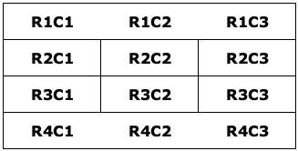
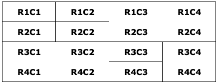
A grid is simply an arrangement of columns and rows as Fig 1 below shows.
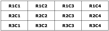
Cells in a grid are identified by the row and column they are in. Thus the cell in the top left hand corner is in row 1 and column 1. That is why it is identified as R1C1.
The cell next to it is in the same row but in coulum 2, hence R1C2. The next two cells are still in Row 1 but in columns 3 and 4 respectively.
The next row will be row 2. Here we go through the four columns again, but this time in row 3. The same applies to row 4.
If we wish to insert an image or text item into any of those cells we simly supply them with the row number and column number.
We shall look at that in our first example below.
Go to top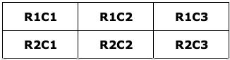
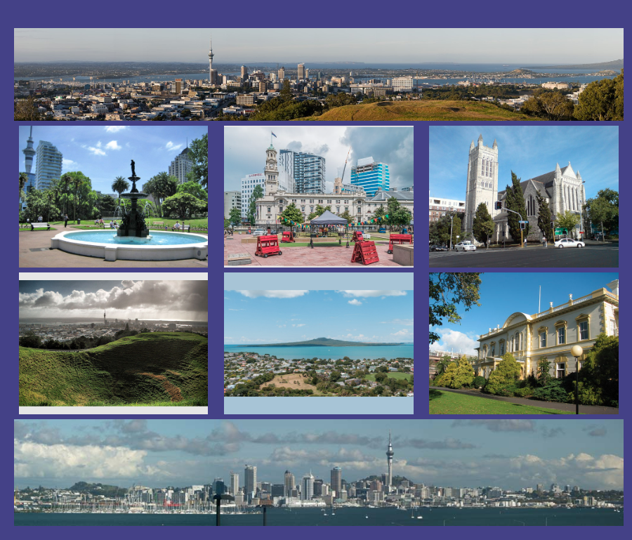
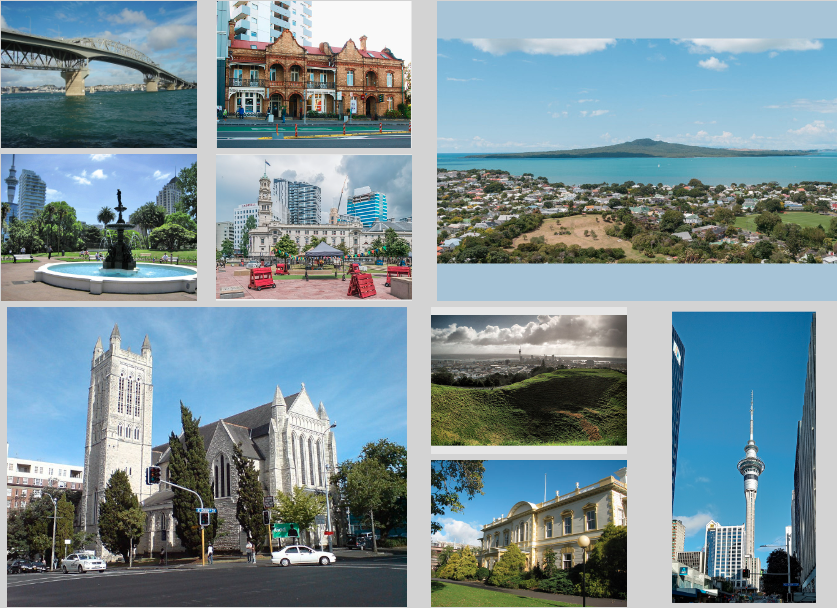
Our first example is a three by two grid, which allows us to show six images, one in each cell.
                        <html lang="en">
                            <head>
                                <title>A well laid out page</title>
                                <link href="GridLayout.css" type="text/css" rel="stylesheet"/>
                            </head>
                            <body>
                                <main>
                                    <article>
                                        <section class="wrapper">
                                            <img src="AlbertPark.jpg" alt="" class="first">
                                            <img src="AoteaSquare.jpg" alt="" >
                                            <img src="StMatthewInTheCity.jpg" alt="" >
                                            <img src="CityFromMtEden.jpg" alt="">
                                            <img src="Rangitoto.jpg" alt="">
                                            <img src="GovernmentHouse.jpg" alt="">
                                        </section>
                                    </article>
                                </main>
                            </body>
                        </html>
Above is the HTML code. A section block spans lines 9 - 16. At line 16 we declare the section block and assign to it a class named "wrapper". It is the code of this class that will control how the images will be displayed in the grid.
Line 10 is the first image. It is assigned a class named "first". The code in this class will cause the image "AlbertPark.jpg" to be displayed in the first cell, i.e. cell R1C1.
You might ask what about the other five images as they don't appear to have any class assigned to them. In the CSS file shown below we shall see how those are also placed in the grid.
Below is the CSS code that explains it all.
                        html{
                            font-size: 100%;
                            background-color: lightgray;
                        }
                        .wrapper {
                          display: grid;
                          grid-template-columns: 33% 33% 33%;
                          grid-gap: 1%;
                        }
                        img{
                            width: 95%;
                            margin: 0 auto;
                        }
                        .first{
                            grid-row: 1;
                            grid-column: 1;
                        }
This piece of code defines two classes: the "wrapper" class which sets up the container that will house the six images. In this case it is the section in the HTMLfile.
The other class is "first". This specifies which cell of the grid an image will be placed.
We shall begin at line 5 where the "wrapper" class is defined.
Line 6 shows display: grid; specifies that data aimed at this container can be placed in a grid formation. More details of what this formation may look like is specified in the next line.
The cumbersomely named property grid-template-columns: specifies how the columns are to be laid out. In this case it means that the grid will be laid out with three columns of equal width.
No rows are mentioned which means that we can have as many rows as we need.
The class "first" specifies that whichever image it is attached to will be placed in the first column of the first row, in other words in the top left hand cell. Looking back to line 10 of listing 1 we see that that image is AlbertPark.jpg.
Okay! So the first image is correctly placed in the grid but how did the other images manage to get placed?
The answer is this: once the first image got placed and there were no other instructions left for placing the other images, the system decided that the other images would be distributed among the other cells in our three by two grid. Looking at Fig 2 we see that this is exactly what happened.
In our next example a panoramic image spans the entire width of the first row while another spans the entire width of the last row. The two rows in the middle will look exactly like Fig 2 above.
Since this example is more complex than its predecessor it is safer to allocate each image to its allocated cell or group of cells. So by the end of this lesson you will know how to place each individual item in the appropriate row and column.
Below is the HTML code for the modified grid.
                        <html lang="en">
                            <head>
                                <title>A well laid out page</title>
                                <link href="GridLayout1.css" type="text/css" rel="stylesheet"/>
                            </head>
                            <body>
                                <header>
                                    <h1>Images of Auckland</h1>
                                    <h2>An Exercise in CSS Grid Layout V2</h2>
                                </header>
                                <main>
                                    <article>
                                        <section class="wrapper">
                                            <img src="AucklandPanorama1.png" alt="" class="bothor" style="width: 100%;">
                                            <img src="AucklandPanorama2.png" alt="" class="tophor" style="width: 100%;">
                                            <img src="AlbertPark.jpg" alt="" class="first">
                                            <img src="AoteaSquare.jpg" alt="" class="second">
                                            <img src="StMatthewInTheCity.jpg" alt="" class="third">
                                            <img src="CityFromMtEden.jpg" alt="" class="fourth">
                                            <img src="Rangitoto.jpg" alt="" class="fifth">
                                            <img src="GovernmentHouse.jpg" alt="" class="sixth">
                                        </section>
                                    </article>
                                </main>
                            </body>
                        </html>
It is structured very similar to its predecessor, the main defference being lines 14 and 15. Those contain the two extra images we are adding to the grid. The other six images are the same is in the previous example.
Also, this time every image has its own class. The two classes attached to the two new images at lines 14 and 15 are named "bothor" and "tophor" which are abbreviations of bottom horizontal and top horizontal respectively. Obviously from their names they control the positioning of the top and bottom images.
The other six classes control the positioning of the six smaller images sandwiched between the two panoramic images.
Below is the CSS code to style the page.
                        .wrapper {
                            display: grid;
                            grid-template-columns: 33% 33% 33%;
                            grid-gap: 1%;
                            padding: 20px;
                        }
                        img{
                            width: 95%;
                            display: block;
                            margin: 0 auto;
                        }
                        .tophor{
                            grid-column: 1/4;
                            grid-row: 1;
                        }
                        .first{
                            grid-column: 1;
                            grid-row: 2;
                        }
                        .second{
                            grid-column: 2;
                            grid-row: 2;
                        }
                        .third{
                            grid-column: 3;
                            grid-row: 2;
                        }
                        .fourth{
                            grid-column: 1;
                            grid-row: 3;
                        }
                        .fifth{
                            grid-column: 2;
                            grid-row: 3;
                        }
                        .sixth{
                            grid-column: 3;
                            grid-row: 3;
                        }
                        .bothor{
                            grid-column: 1/4;
                            grid-row: 4;
                        }
Lines 1 - 11 should be familiar by now and therefore we shall begin with line 12. Here between lines 12 and 15 the class "tophor" is defined.
At line 13 the statement grid-column: 1/4; may appear odd to you. If it does then that is because it is odd. As you might expect the 1 refers to column 1 while the four refers to the next free column after we have reserved the space for the image. This of course means column 3, but it is a very roundabout way of saying it.
The point to remember here is that if you see two numbers separated by a slash when referring to grid-column or grid-row take the first number as it is and subtract 1 from the second number.
After all that what line 13 is saying is that the image will stretch from column 1 to column 3.
Meanwhile what line 14 is telling you is that the same image is confined to row 1
This complies with the layout shown in Fig 3 above.
Now let us look at the other classes.
The class "first" spans lines 16 - 19. It clearly specifies that the image it refers to will be placed in the first column of the second row.
Similarly the class "second" specifies that the image it refers to will be placed in the second column of the second row. The same logic applies to all of the other classes down to and including "sixth".
Finally at lines 40 - 43 the class "bothor" states the in the fourth row columns 1 to 3 are reserved for storing another panoramic image.
Above Fig 3 shows how our grid should look.
Go to topThis example is a variation on the previous one. In this case we have wide images that only take up two columns instead of three. This arrangement is shown in the diagram below.
As shown above one image will take up the second and third cells in row 1, while the other image will take up the first and second cells in row 3.
                         <html lang="en">
                             <head>
                                 <title>A well laid out page</title>
                                 <link href="GridLayout2.css" type="text/css" rel="stylesheet"/>
                             </head>
                             <body>
                                 <header>
                                     <h1>Images of Auckland</h1>
                                     <h2>An Exercise in CSS Grid Layout V3</h2>
                                 </header>
                                 <main>
                                     <article>
                                         <section class="wrapper">
                                             <img src="1280px-Sunset_over_Auckland.jpg" alt="" class="bothor">
                                             <img src="PalmBeach.png" alt="" class="tophor">
                                             <img src="AlbertPark.jpg" alt="" class="first">
                                             <img src="AoteaSquare.jpg" alt="" class="second">
                                             <img src="StMatthewInTheCity.jpg" alt="" class="third">
                                             <img src="CityFromMtEden.jpg" alt="" class="fourth">
                                             <img src="Rangitoto.jpg" alt="" class="fifth">
                                         </section>
                                     </article>
                                 </main>
                             </body>
                         </html>
Again the code above does not need any explanation as the only changes are the first two file names in lines 14 and 15.
                        .wrapper {
                            display: grid;
                            grid-template-columns: 32% 32% 32%;
                            grid-gap: 1%;
                            align-items: center;
                        }
                        img{
                            width: 95%;
                            display: block;
                            margin: 0 auto;
                        }
                        first{
                            grid-column: 1;
                            grid-row: 1;
                        }
                        .tophor{
                            grid-column: 2/4;
                            grid-row: 1;
                        }
                        .second{
                            grid-column: 1;
                            grid-row: 2;
                        }
                        .third{
                            grid-column: 2;
                            grid-row: 2;
                        }
                        .fourth{
                            grid-column: 3;
                            grid-row:2;
                        }
                        .fifth{
                            grid-column: 3;
                            grid-row:3;
                        }
                        .bothor{
                            grid-column: 1/3;
                            grid-row: 3;
                        }
The only item that needs explanation in the CSS file is line 5.
In this example we first face the problem that images of different heights may appear in the same column. When this happens to column is resized to the height of the highest image. How do we deal with the vertical positioning of the shorter images?
In line 5 we use the property align-items and give it a value of center. This will cause the shorter images to be centered vertically.
The rest of the code needs no explanation.
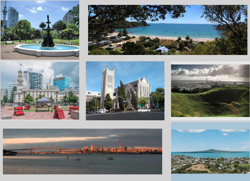
Fig 3 shows the rearranged grid.
Go to topUp to now we only have stretched images along columns. In this example we shall stretch them along rows as well as along columns. Fig 6 below shows the arrangement
The block R1C1 to R2C2 has no stretching and thus four images can fit into that block. However R1C3 to R2C4 have been converted to a single cell, thus one image fits into this four cell block.
For a similar reason to the above only one image will fit into the block R3C1 to R4C2.
A single image each will fit into the two cells: R3C3 to R4C3 and a single tall image will fit into the block R3C4 to R4C4.
                        <html lang="en">
                          <head>
                                <title>A well laid out page</title>
                                <link href="GridLayout3.css" type="text/css" rel="stylesheet"/>
                            </head>
                            <body>
                                <header>
                                    <h1>Images of Auckland</h1>
                                    <h2>An Exercise in CSS Grid Layout V4</h2>
                                </header>
                                <main>
                                    <article>
                                        <section class="wrapper">
                                            <img src="480px-Auckland_Habour_Bridge_(9380408897).jpg" alt="" class="first">
                                            <img src="TerraceHouse.jpg" alt="" class="second">
                                            <img src="AlbertPark.jpg" alt="" class="third">
                                            <img src="AoteaSquare.jpg" alt="" class="fourth">
                                            <img src="StMatthewInTheCity.jpg" alt="" class="botsqr">
                                            <img src="CityFromMtEden.jpg" alt="" class="fifth">
                                            <img src="SkyTower2.jpg" alt="" class="sixth" style="width:70%;">
                                            <img src="GovernmentHouse.jpg" alt="" class="seventh">
                                            <img src="Rangitoto.jpg" alt="" class="topsqr">
                                        </section>
                                    </article>
                                </main>
                            </body>
                        </html>
The above code gives no impression of the complexity of the layout. Apart from that there is nothing new introduced here so we shall move on to the CSS code below.
                        .wrapper {
                            display: grid;
                            grid-template-columns: 24% 24% 24% 24%;
                            grid-gap: 1%;
                            align-items: center;
                            align-content: center;
                        }
                        img{
                            width: 95%;
                            display: block;
                            margin: 0 auto;
                        }
                        .first{
                            grid-column: 1;
                            grid-row: 1;
                        }
                        .second{
                            grid-column: 2;
                            grid-row: 1;
                        }
                        .third{
                            grid-column: 1;
                            grid-row: 2;
                        }
                        .fourth{
                            grid-column: 2;
                            grid-row: 2;
                        }
                        .topsqr{
                            grid-column: 3/5;
                            grid-row: 1/3;
                        }
                        .botsqr{
                            grid-column: 1/3;
                            grid-row: 3/5;
                        }
                        .fifth{
                            grid-column: 3;
                            grid-row: 3;
                        }
                        .sixth{
                            grid-column: 4;
                            grid-row:3/5;
                        }
                        .seventh{
                            grid-column: 3;
                            grid-row:4;
                        }
Lines 5 and 6 are worth mentioning first. We have met the align-items property earlier; it centers items vertically in rows if given a value of center.
Here we have added the align-content property. This centers items horizontally, again if given a value of center.
Lines 13 to 28 should need no explanation at this stage, so we will examine the classes "botsqr" and "topsqr"; both abbreviations of top square and bottom square.
The class "topsqr" involves the square made by cells R1C3, R1C4, R2C3 and R2C4. This is the square into which the image of Rangitoto is to be inserted
The class "botsqr" involves the squre made by the cells R3C1, R3C2, R4C1 and R4C2. This is the square into which the image of St Matthew's Church is to be inserted.
The rest of the class should be familiar to you.
The resulting grid is shown below.
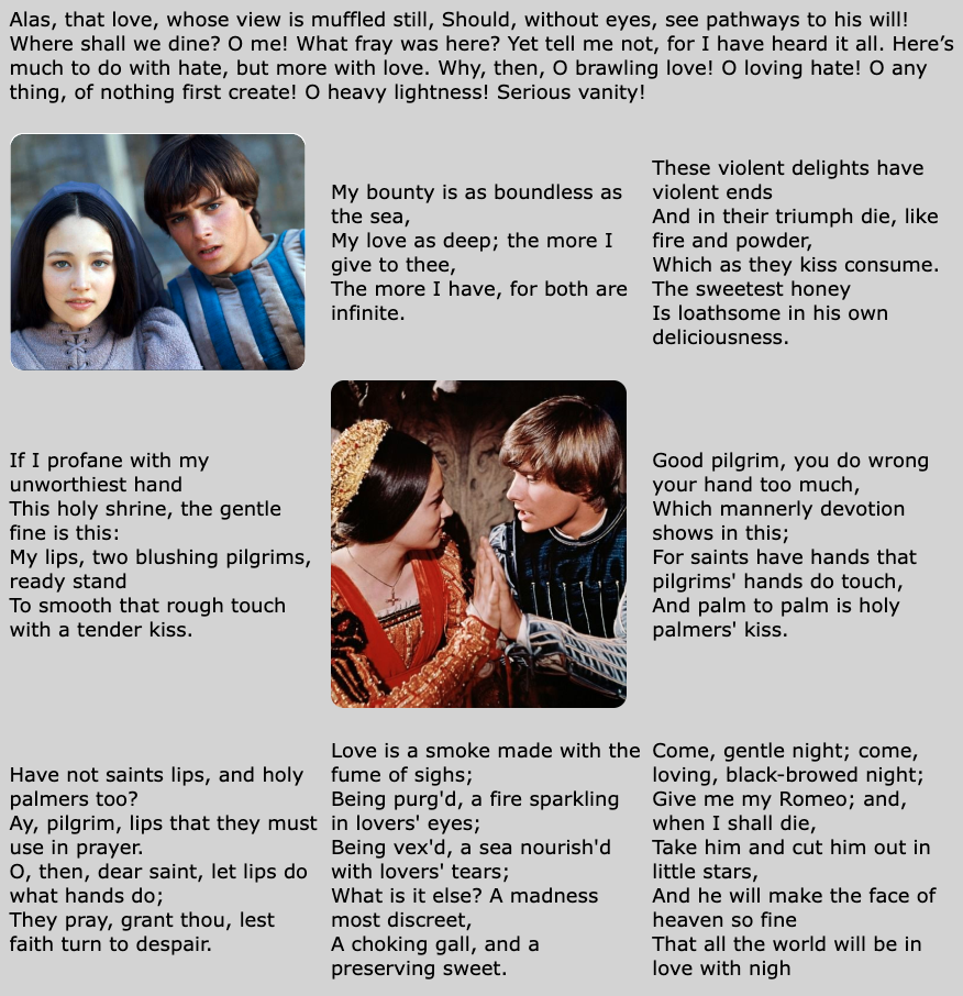
There is nothing new introduced here. It has been inserted just to demonstrate that text can be used as an element of a grid just like images. Having loved the film of Romeo and Juliet since I first saw it years ago I used a number of quotations and two images of the film in order to create a literary grid
                        <html lang="en">
                            <head>
                                <title>A well laid out page</title>
                                <link href="GridLayout4.css" type="text/css" rel="stylesheet"/>
                            </head>
                            <body>
                                <header>
                                    <h1>Romeo and Juliet</h1>
                                    <h2>Short extracts from the play</h2>
                                </header>
                                <main>
                                    <article>
                                        <section class="wrapper">
                                            <p class="first">Alas, that love, whose view is muffled still, Should, without eyes, see pathways to his will! Where shall we dine? O me! What fray was here? Yet tell me not, for I have heard it all. Here’s much to do with hate, but more with love. Why, then, O brawling love! O loving hate! O any thing, of nothing first create! O heavy lightness! Serious vanity!</p>
                                            <img src="RJ1.png" alt="" class="second">
                                            <p> My bounty is as boundless as the sea,<br>My love as deep; the more I give to thee,<br>The more I have, for both are infinite.</p>
                                            <p >These violent delights have violent ends<br>And in their triumph die, like fire and powder,<br>Which as they kiss consume. The sweetest honey<br>Is loathsome in his own deliciousness.<br></p>
                                            <p> If I profane with my unworthiest hand<br>This holy shrine, the gentle fine is this:<br>My lips, two blushing pilgrims, ready stand<br>To smooth that rough touch with a tender kiss.<br></p>
                                            <img src="RJ2.png" alt="" >
                                            <p> Good pilgrim, you do wrong your hand too much,<br>Which mannerly devotion shows in this;<br>For saints have hands that pilgrims' hands do touch,<br>And palm to palm is holy palmers' kiss.<br></p>
                                            <p> Have not saints lips, and holy palmers too?<br>Ay, pilgrim, lips that they must use in prayer.<br>O, then, dear saint, let lips do what hands do;<br>They pray, grant thou, lest faith turn to despair.<br></p>
                                            <p> Love is a smoke made with the fume of sighs;<br>Being purg'd, a fire sparkling in lovers' eyes;<br>Being vex'd, a sea nourish'd with lovers' tears;<br>What is it else? A madness most discreet,<br>A choking gall, and a preserving sweet.<br></p>
                                            <p >Come, gentle night; come, loving, black-browed night;<br>Give me my Romeo; and, when I shall die,<br>Take him and cut him out in little stars,<br> And he will make the face of heaven so fine<br>That all the world will be in love with nigh<br></p>
                                        </section>
                                    </article>
                                </main>
                            </body>
                        </html>
Below is the CSS code to style the page.
                        .wrapper {
                            display: grid;
                            grid-template-columns: 33% 33% 33%;
                            grid-gap: 1%;
                            align-items: center;
                            align-content: center;
                        }
                        img{
                            width: 95%;
                            border-radius: 12px
                        }
                        .first{
                            grid-column: 1/4;
                            grid-row: 1;
                        }
                        .second{
                            grid-column: 1;
                            grid-row: 2;
                        }
Absolutely no new concepts are introduced here. One thing to note is that the first row spans three columns, which can be seen from lines 13 and 14 of the class "first".
The next item starts at R2C1 and is styled using the class "second". No other classes are defined. However since all other items added to the grid go into single cells, the class "second" has been applied to all of them