Learning Outcomes
On completion of this page you will have more formal knowledge of selectors and their accompanying rules. You will also have gained experience of different selector combinations.
Go to top
On completion of this page you will have more formal knowledge of selectors and their accompanying rules. You will also have gained experience of different selector combinations.
Go to topAs by now you may be fairly familiar with CSS on a need to know basis, it is time to formalise your knowledge of this area of web development.
The code below in Listing 1 is fairly straightforward. It is easy to work out that it is specifying the styling for the header element, i.e. the first element inside the element main.
In the sequence that they are presented in, the styling instructions are:
                        header{
                            background-color: darkorange;
                            width: 900px;
                            margin: 0 auto;
                            border-top-left-radius: 20px;
                            border-top-right-radius: 20px;
                        }
Now let us examine the above listing in a more formal manner.
The word header is in this case referred to as a selector. What follows it, i.e. contents of lines 2 to 6 is referred to as rules.
The entire contents of Listing 1 could thus be paraphrased as 'Search the HTML file and select all elements that match the keyword header. For every match found apply the styling below to that element.
Of course any html file should have only one header element, which means that only one match at the most will be found. However, what we have said about header equally applies to other selectors such as article, p and all of the selectors that you have been using up to now.

Here we see the result of styling a header element using the styling code from Listing 1.
Go to topType selectors use the value of the selector in the CSS file to match up with corresponding elements in the HTML file. In other words they match up elements of the same type.
Our example in Listing 1 was a type selector as are the examples we shall be looking at below.
                        <html>
                            <head>
                                <link href="Type.css" rel="stylesheet" type="text/css">
                            </head>
                            <body>
                                <main>
                                    <article>
                                        <p>Lorem ipsum dolor sit amet, consectetur adipiscing elit. Maecenas convallis diam et ex vestibulum, a facilisis nunc pulvinar.Pellentesque quam augue, sollicitudin id velit a, pellentesque commodo dui. Ut rhoncus erat sit amet tortor commodo tristique. Nam turpis ipsum, eleifend non eros non, pharetra mollis sem.</p>
                                    </article>
                                    <article>
                                        <p>Sed aliquet, ex et consequat bibendum, purus ipsum mollis massa, sit amet rhoncus magna neque eget velit. Nullam et velit lorem. Proin aliquam volutpat neque, vel faucibus orci ullamcorper ac. In tincidunt lorem vitae dolor sodales, ut interdum metus molestie.</p>
                                    </article>
                                </main>
                            </body>
                        </html>
In the HTML code above we have two article blocks inside the main. This is a better example than Listing 1 of the fact that one selector in the CSS file match all elements of the same type in the HTML file.
                        html{
                            font-size: 100%
                        }
                        main{
                            width: 800px;
                            margin: 0 auto;
                            background-color: antiquewhite;
                            padding-top: 12px;
                            padding-bottom: 12px;
                            border: thin solid black
                        }
                        article{
                            width: 80%;
                            background-color: floralwhite;
                            margin: 0 auto;
                            border-bottom: thin solid black;
                            font-size: 1rem;
                            padding: 10px;
                        }
The result of the above styling is shown below in Fig 3.
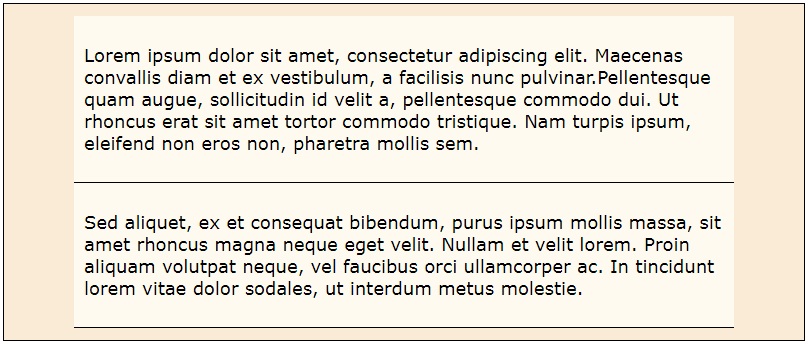
Here we see that the two <article> elements marked up in lines 7 to 12 of Listing 2 have been styled by the rules associated with the article selector that span lines 12 to 19 of Listing 3
The correspondences between what we see in Fig 3 and the styling rule in Listing 3 include:
Thus the article selector in line 12 of Listing 3 found two matching types in the HTML code of Listing 2 and styled them according to the styling rules specified in lines 13 to 18 of Listing 3.
Go to topIn Listing 2 and Listing 3 we saw that a single article selector from Listing 3 was able to identify and style the two <article> elements in Listing 2. The same selector was able to equally style any number of other <article> elements on the same page. This form of styling contributes to the maintainibility, readability and consistency of web pages, and is therefore the recommended way of styling.
For any number of reasons, however, we may want to style one single <article> element differently from the rest. In this situation we use class selectors.
                        <html>
                            <head>
                                <link href="Class.css" rel="stylesheet" type="text/css">
                            </head>
                            <body>
                                <main>
                                    <article>
                                        <p>Lorem ipsum dolor sit amet, consectetur adipiscing elit. Maecenas convallis diam et ex vestibulum, a facilisis nunc pulvinar.Pellentesque quam augue, sollicitudin id velit a, pellentesque commodo dui. Ut rhoncus erat sit amet tortor commodo tristique. Nam turpis ipsum, eleifend non eros non, pharetra mollis sem.</p>
                                    </article>
                                    <article>
                                        <p>Sed aliquet, ex et consequat bibendum, purus ipsum mollis massa, sit amet rhoncus magna neque eget velit. Nullam et velit lorem. Proin aliquam volutpat neque, vel faucibus orci ullamcorper ac. In tincidunt lorem vitae dolor sodales, ut interdum metus molestie.</p>
                                    </article>
                                    <article class="oddOne">
                                        <p>Vestibulum commodo feugiat elit id tempor. Vestibulum metus ligula, vestibulum nec sodales eget, lacinia non mi. Nullam congue lacus vitae diam rhoncus eleifend. Suspendisse in magna hendrerit, sodales leo sit amet, convallis massa. Phasellus sed sagittis odio, at ultricies nisi. Proin mollis felis feugiat eleifend feugiat..</p>
                                    </article>
                                </main>
                            </body>
                        </html>
Listing 4 above is almost identical to Listing 2. The difference between them is that we have added another <article> block to Listing 4. This block spans lines 13 to 15.
Notice that at line 13 we have added class = "oddOne" to the opening tag. This means that this block and this block alone will be styled by both the article selector in the CSS file of Listing 5 and by the class oddOne that spans lines 19 and 20 of the same file.
                        html{
                            font-size: 100%
                        }
                        main{
                            width: 800px;
                            margin: 0 auto;
                            background-color: beige;
                            padding-top: 12px;
                            padding-bottom: 12px;
                        }
                        article{
                            width: 80%;
                            background-color: floralwhite;
                            margin: 0 auto;
                            border-bottom: thin solid black;
                            font-size: 1rem;
                            padding: 10px;
                        }
                        .oddOne{
                            background-color: aqua;
                        }
In the listing above we see that the class oddOne simply changes the background colour of the <article> block to the colour aqua.
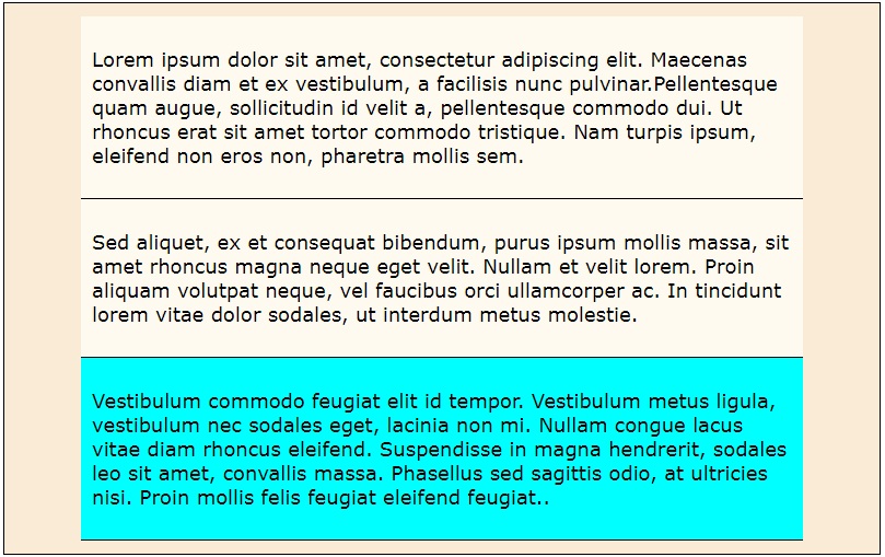
In Fig 4 we see the new <article> block with its aqua background. Also notice that, other than the background, its styling is identical to the other two <article> blocks. This means that it has been styled by the article selector at line 11 of Listing 5 as regards its size, positioning, border, font size and padding, while oddOne changed the background colour.
Go to topFrequently we have a number of different element types that we want to style the same way. A good example are the elements <header>, <main> and <footer>
We need those three elements styled so that they are all the same width and are horizontally centered on the screen. The code for the HTML is shown below in Listing 6.
                        <html>
                            <head>
                                <link href="Selector%20List.css" rel="stylesheet" type="text/css">
                            </head>
                            <body>
                                <header>
                                    <h1>Phasellus non aliquet felis</h1>
                                </header>
                                <main>
                                    <h2>Proin hendrerit venenatis pharetra</h2>
                                    <article>
                                        <p>Lorem ipsum dolor sit amet, consectetur adipiscing elit. Maecenas convallis diam et ex vestibulum, a facilisis nunc pulvinar.Pellentesque quam augue, sollicitudin id velit a, pellentesque commodo dui. Ut rhoncus erat sit amet tortor commodo tristique. Nam turpis ipsum, eleifend non eros non, pharetra mollis sem.</p>
                                    </article>
                                    <article>
                                        <p>Sed aliquet, ex et consequat bibendum, purus ipsum mollis massa, sit amet rhoncus magna neque eget velit. Nullam et velit lorem. Proin aliquam volutpat neque, vel faucibus orci ullamcorper ac. In tincidunt lorem vitae dolor sodales, ut interdum metus molestie.</p>
                                    </article>
                                </main>
                                <footer>
                                    <p>Cras tincidunt nibh sed lorem laoreet, in bibendum mi vehicula. Sed pulvinar mi mi, et varius magna tempor vitae. Nam lobortis ligula tortor, venenatis dignissim sem dictum vel.</p>
                                </footer>
                            </body>
                        </html>
For styling the <header>, <main> and <footer> we have the very short piece of CSS code shown in Listing 7 below.
                        header, main, footer{
                            width: 800px;
                            margin: 0 auto;
                            padding: 12px;
                        }
Notice that at line 1 the selectors header, main and footer are on the same line forming a comma separated list. Presenting them this way ensures that the rules specified in lines 2 to 4 will be applied to the <header>, the <main> and the <footer> elements, thus avoiding having to repeat the same styling instructions three times.
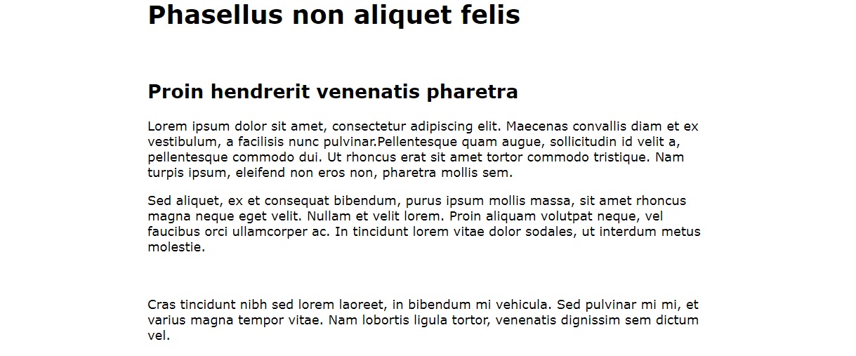
Fig 5 shows that the same width and positioning specified in lines 2 and 3 have been applied to each of the three elements. We cannot testify to padding since no background colouring has been applied and no borders have been drawn.
As you can see there is plenty of room for improvement. To begin with, apart from the two headings, there is very little information here and we can only use guesswork to determine which area of the page our three blocks of text belong to. We need to use the extra code in listing 8 below to provide the required information for us.
                        html{
                            font-size: 100%
                        }
                        header, main, footer{
                            width: 800px;
                            margin: 0 auto;
                            padding: 12px;
                        }
                        header{
                            background-color: darkorange;
                            border-top-left-radius: 20px;
                            border-top-right-radius: 20px;
                        }
                        main{
                            background-color: beige;
                        }
                        footer{
                            background-color: #444;
                            color: white;
                            border-bottom-left-radius: 20px;
                            border-bottom-right-radius: 20px;
                        }
                        h1, h2{
                            text-align: center;
                        }
                        article{
                            width: 80%;
                            background-color: floralwhite;
                            margin: 0 auto;
                            border-bottom: thin solid black;
                            font-size: 1rem;
                            padding: 10px;
                        }
Fig 8 shows the complete CSS file. Notice that the selector list has moved to line 4.
The selector and rules spanning lines 9 to 12 specify the styling instructions that are unique to the <header>, which is dark orange background and the two top corners being rounded.
The rule at line 15 ensures that <main> is coloured beige in order to be visually unintrusive to any content placed inside it.
The selector and rules spanning lines 17 to 22 ensure that the footer is give the standard colouring or a dark grey background and white text, and its bottom corners are rounded to complement those of the <header>
At lines 23 to 25 is again a selector list where two different selectors, h1 and h2 have a rule for center aligning the text of their corresponding elements <h1> and <h2>
Lines 26 to 33 are identical to heir equivalents in the previous listings and therefore there is not need to spend any time on them.
We see that the CSS file shown in Listing 8 has both selectors and selector lists. This, along with class selectors is the norm in most CSS files.
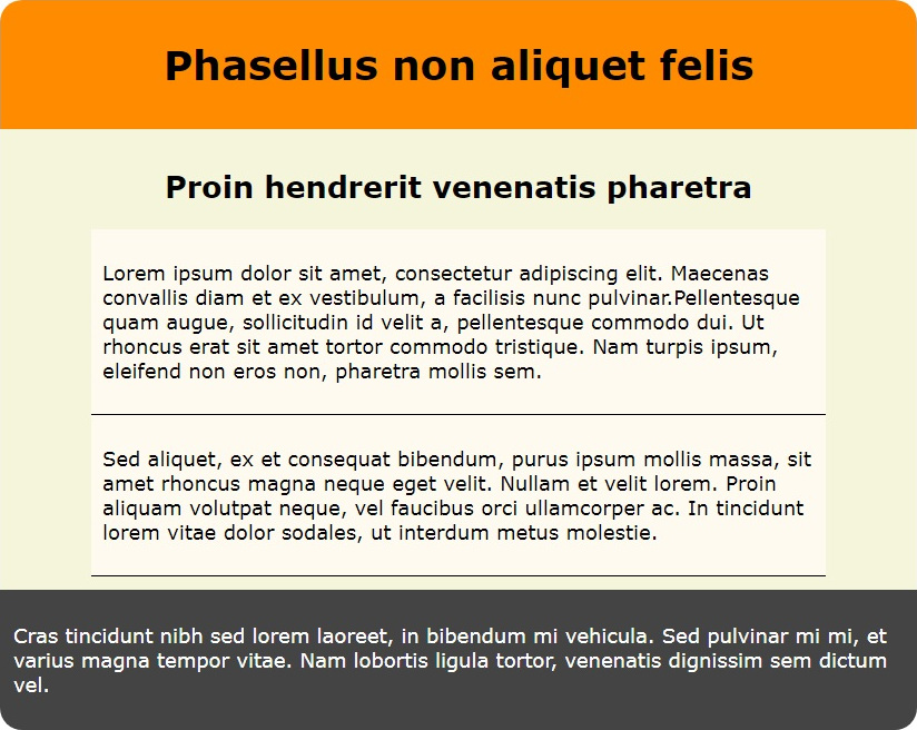
Fig 6, although it contains exactly the same text as Fig 5, is much more informative. The strong colours of dark orange and dark grey with the more bland colours between clearly indicate the regions of header, main and footer
Also the two <article> blocks are clearly identified by their lighter background colours.
Go to topDescendants in this case means child elements or grand child elements to any level that are descendants of the top level element. To explore this we have below a somewhat more complex arrangement of elements than we have used so far.
                        <html>
                            <head>
                                <link href="Descendant%20Combinator.css" rel="stylesheet" type="text/css">
                            </head>
                            <body>
                                <main>
                                    <article>
                                        <p>Lorem ipsum dolor sit amet, consectetur adipiscing elit. Maecenas convallis diam et ex vestibulum, a facilisis nunc pulvinar.Pellentesque quam augue, sollicitudin id velit a, pellentesque commodo dui. Ut rhoncus erat sit amet tortor commodo tristique. Nam turpis ipsum, eleifend non eros non, pharetra mollis sem.</p>
                                        <section>
                                            <p> Maecenas eu facilisis nisi, eget bibendum eros. Fusce quam est, iaculis sed cursus ac, sagittis vel lorem. Fusce vestibulum vel elit id euismod. Donec massa neque, blandit malesuada pulvinar in, commodo a massa. Nunc leo mauris, bibendum eget massa ac, lobortis porta lectus.</p>
                                            <aside>
                                                <p>Suspendisse ac ligula vestibulum, iaculis sapien quis, pretium lacus. Pellentesque tempor facilisis mi sed imperdiet. Lorem ipsum dolor sit amet, consectetur adipiscing elit. Mauris velit risus, tristique efficitur mollis sit amet, consectetur in purus.</p>
                                            </aside>
                                        </section>
                                        <aside>
                                            <p>Phasellus facilisis lorem nec dui volutpat ultricies. Donec blandit, enim at volutpat tincidunt, elit magna fringilla dolor, at volutpat velit dolor vitae nisl.</p>
                                        </aside>
                                    </article>
                                    <aside>
                                        <p>Sed aliquet, ex et consequat bibendum, purus ipsum mollis massa, sit amet rhoncus magna neque eget velit. Nullam et velit lorem. Proin aliquam volutpat neque, vel faucibus orci ullamcorper ac. In tincidunt lorem vitae dolor sodales, ut interdum metus molestie.</p>
                                    </aside>
                                </main>
                            </body>
                        </html>
Directly inside <main> we have two elements: an <article> element that spans lines 7 to 18 and an <aside> that spans lines 19 to 21. These are direct descendants or child elements of <main>.
Inside the <article> block we have both a <section> and an <aside>. The <section> spans lines 9 to 14 and the <aside> spans lines 15 to 17. Those are direct descendants or child elements of <article>. They are also two levels below <main>
Finally the <section> itself has an <aside> element that spans lines 11 to 13. This element is two levels below <article> and three levels below <main>
Thus we have three <aside> elements:
We shall be using the three different levels of those three <aside> elements to explore how the descendant combinator works. First, however, we need to look at the accompanying CSS file.
                        html{
                            font-size: 100%
                        }
                        main{
                            width: 800px;
                            margin: 0 auto;
                            background-color: beige;
                            padding-top: 12px;
                            padding-bottom: 12px;
                        }
                        article{
                            width: 80%;
                            background-color: floralwhite;
                            margin: 0 auto;
                            font-size: 1rem;
                            padding: 10px;
                            border: thin solid black;
                        }
                        section{
                            background-color: #444;
                            color: yellow;
                            padding: 10px;
                        }
                        article aside{
                            background-color: aqua;
                            color: darkblue;
                        }
Above in Listing 10 is the CSS file for styling the code in Listing 9. Most of this is already familiar with the exception of the descendant combinator that spans lines 24 to 26.
At line 24 the combinator is the space between the selectors article and aside
This combinator means that the styling specified in lines 25 and 26 is to be applied to any <aside> element that is a descendant of <article>, no matter how many levels down. This applies to the two <aside> elements spanning lines 11 to 13 and 15 to 17 of Listing 9. These are the elements whose text start with 'Suspendisse' and 'Phasellus'.
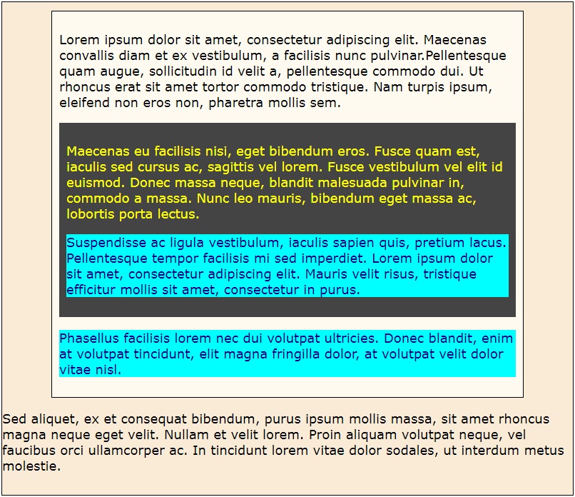
Here we see that the two relevant <aside> elements have an aqua background and dark blue text as specified in lines 25 and 26 of Listing 10.
Go to topThe child combinator, the greater than sign, is more precise than the descendant combinator. With the child combinator the relationship goes strictly from parent to child and no further
                        <html>
                            <head>
                                <link href="Child%20Combinator.css" rel="stylesheet" type="text/css">
                            </head>
                            <body>
                               <main>
                                    <article>
                                        <p>Lorem ipsum dolor sit amet, consectetur adipiscing elit. Maecenas convallis diam et ex vestibulum, a facilisis nunc pulvinar.Pellentesque quam augue, sollicitudin id velit a, pellentesque commodo dui. Ut rhoncus erat sit amet tortor commodo tristique. Nam turpis ipsum, eleifend non eros non, pharetra mollis sem.</p>
                                        <section>
                                            <p> Maecenas eu facilisis nisi, eget bibendum eros. Fusce quam est, iaculis sed cursus ac, sagittis vel lorem. Fusce vestibulum vel elit id euismod. Donec massa neque, blandit malesuada pulvinar in, commodo a massa. Nunc leo mauris, bibendum eget massa ac, lobortis porta lectus.</p>
                                            <aside>
                                                <p>Suspendisse ac ligula vestibulum, iaculis sapien quis, pretium lacus. Pellentesque tempor facilisis mi sed imperdiet. Lorem ipsum dolor sit amet, consectetur adipiscing elit. Mauris velit risus, tristique efficitur mollis sit amet, consectetur in purus.</p>
                                            </aside>
                                        </section>
                                        <aside>
                                            <p>Phasellus facilisis lorem nec dui volutpat ultricies. Donec blandit, enim at volutpat tincidunt, elit magna fringilla dolor, at volutpat velit dolor vitae nisl.</p>
                                        </aside>
                                    </article>
                                    <aside>
                                        <p>Sed aliquet, ex et consequat bibendum, purus ipsum mollis massa, sit amet rhoncus magna neque eget velit. Nullam et velit lorem. Proin aliquam volutpat neque, vel faucibus orci ullamcorper ac. In tincidunt lorem vitae dolor sodales, ut interdum metus molestie.</p>
                                    </aside>
                                </main>
                            </body>
                        </html>
For our example we shall use the same HTML file as before so we can see how the child combinator differs from the descendant combinator.
We are using the same CSS file as in Listing 10, apart from line 24. For this reason we are showing below only line 24 onwards.
                        article > aside{
                            background-color: aqua;
                            color: darkblue;
                        }
In this example the match for the combinator is an <aside> element that is directly inside an <article> element. Let us examine Listing 11 to see which ones fit and which don't.
The <aside> element spanning lines 11 to 13 is a direct descendant of <section> and not of <article> and therefore does not fit.
The <aside> element spanning lines 15 to 17, i.e. the one whose text starts with 'Phasellus' is a direct descendent of <article> and therefore will be matched by the combinator.
The <aside> element that spans lines 19 to 21 is a direct child of <main> and is on the same level as <article>. For this reason the combinator does not apply to it.
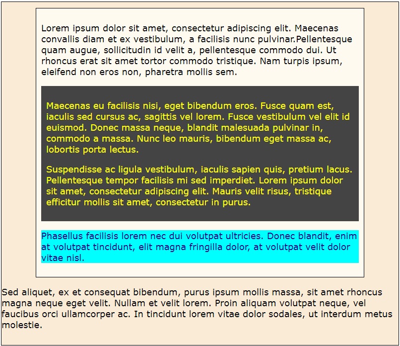
Here we see that the <aside> element whose text begins with 'Phassellus' is the only one matched by the child combinator as it is the only one that has an aqua background and dark blue text colour.
The <aside> element whose text begins with 'Suspendisse' was not selected this time. This is because it is the direct child of a <section> element, not of an <article> element.
The third <aside> element has not been matched by either the descendant combinator or the child combinator. This is because it was on the same level as <article> and therefore was not a child or descendant of it.
Go to topThe combinator for the adjacent sibling is the plus sign. For our example we shall look at a scenario of a web page with images and each image gets a comprehensive commentary. One feature of the layout is that the first paragraph directly after the image will have its text in bold, so that it serves as a caption for that image.
                        <html>
                            <head>
                                <link href="Adjacent%20Sibling%20Combinator.css" rel="stylesheet" type="text/css">
                            </head>
                            <body>
                                <main>
                                    <img src="Adjacent%20Sibling%20Combinator.jpg">
                                    <p>Lake Whakatipu, formed according to Maori legend when the hero Matakauri killed the taniwha that had stolen the maiden whom he loved.</p>
                                    <p>The lake is a larg S-shaped stretch of water. Queenstown is the largest settlement on the lake. It can be seen here in the lower left hand side of the picture</p>
                                </main>
                            </body>
                        </html>
The HTML code is shown above. The <main> consists of an image followed by two <article> elements.
                        main{
                            width: 600px;
                            margin: 0 auto;
                            background-color: beige;
                            padding: 20px;
                        }
                        img{
                            width: 80%;
                            margin-left: auto;
                            margin-right: auto;
                            display: block;
                        }
                        img+p{
                            font-weight: bold;
                            text-align: center;
                        }
The CSS for styling the above HTML is in Listing 14. The first 12 lines should need no explanation, so we shall concentrate on lines 13 to 16.
The adjacent sibling combinator img+p matches every <img> that is directly followed by a <p> element. For each match the paragraph that directly follows the image is styled according to the rules in lines 14 and 15, which is having the text bold and centered.
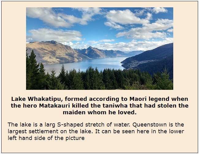
The adjacent sibling combinator is shown at work above. The first paragraph after the image is bold and centered just as the rules at lines 14 and 15 specify.
The text of the second paragraph is left justified and normal font weight because it is using the browser's default properties and is not affected by the adjacent sibling combinator.
Go to topThe uploaded file is a detailed educational resource focused on CSS selectors and their applications in web development. It begins with a section titled "Learning Outcomes," outlining the objectives, which include gaining formal knowledge of CSS selectors and experience with various selector combinations.
The "Introduction" section provides context for the importance of CSS selectors in web design. It explains the concept of selectors and rules through examples, demonstrating how CSS rules are applied to HTML elements based on matching selectors. A sample CSS rule is shown to style a header element, specifying attributes like background color, width, and border radius.
The "Type Selector" section discusses how CSS selectors can match HTML elements of the same type. Using examples, it illustrates how a single CSS rule can style multiple elements of the same type, ensuring consistency and efficiency.
Next, the "Class Selector" section explains the use of class selectors to target specific elements for unique styling while maintaining global styling rules. Examples highlight how a particular article element can be differentiated from others using a class.
The "Selector List" section introduces a method to apply the same style to multiple types of elements using a comma-separated list. It demonstrates this technique with header, main, and footer elements, ensuring uniform width, alignment, and padding.
Moving to more complex selectors, the "Descendant Combinator" section describes how to target elements that are nested within other elements, regardless of the nesting level. This concept is illustrated with examples of article and aside elements in nested structures.
The "Child Combinator" section refines the discussion by focusing on selectors that specifically target immediate child elements. It contrasts this with the descendant combinator to highlight the precise nature of the child combinator.
The "Adjacent Sibling Combinator" section explores the use of the plus sign to target elements that immediately follow a specific element. This is exemplified by styling the first paragraph following an image as a caption with bold text.
The file concludes with links to external resources for further learning about CSS selectors, including detailed lists and explanations on reputable web development sites.
Go to topIn this assignment, you are invited to explore and demonstrate your comprehension of CSS selectors and their practical applications in web development. Using the knowledge presented in the resource, articulate your understanding through a descriptive and analytical narrative. Your submission should reflect your grasp of the following concepts:
1. Begin by explaining the purpose and functionality of CSS selectors. Describe the role they play in applying styles to specific HTML elements.
2. Dive into the "Type Selector" and explain its mechanism for targeting all elements of a specific type. Provide examples to illustrate how this selector ensures consistency across elements.
3. Elaborate on "Class Selectors" and how they allow for more granular control over styling individual elements while retaining a broader styling scheme. Discuss the benefits of this approach in enhancing maintainability and readability.
4. Analyze the use of "Selector Lists" to apply shared styles to multiple element types. Explain how this method prevents redundancy in CSS rules and improves efficiency.
5. Discuss the "Descendant Combinator" and its ability to target elements nested within other elements. Highlight how it facilitates complex and flexible styling scenarios.
6. Compare the "Child Combinator" with the "Descendant Combinator," emphasizing its specificity in targeting only immediate child elements. Include examples to differentiate their applications.
7. Explore the "Adjacent Sibling Combinator" and its unique capability to style elements that directly follow a specified sibling. Provide insights into practical scenarios where this combinator is useful.
8. Conclude by reflecting on the significance of mastering these selectors in building dynamic and responsive web designs. Connect your analysis to broader principles of usability and accessibility in web development.
Your narrative should incorporate technical language and demonstrate a clear understanding of CSS selectors as covered in the resource. Feel free to use hypothetical examples, illustrations, or analogies to enhance your explanation. Remember, this is not about writing code but about showcasing your comprehension of the material in a flowing, descriptive manner.
Go to top