Learning Outcomes
On completion of this page you will know how to develop a web page that automatically responds to the width of the screen that contains it.
Go to top
On completion of this page you will know how to develop a web page that automatically responds to the width of the screen that contains it.
Go to topDue to the internet computer data can now be displayed on 400 pixel cellphones, on 5120 pixel super monitors and any number of other monitors and tablets with sizes between these two extremes.
Due to it's small screen size there is a limit to how we can design our web pages to suit a cellphone. As we get to the larger monitors, however, we can be more inventive about how we lay out both our text and images.
Although as the size of monitors gets bigger bigger we can be more inventive with our designs. Once we reach the 1000px limit, however, then one should stop further designing. Why is ths? Have you tried reading a large block of text across a window that is 1000 px wide? It is a frustrating and exhausting experience.
There are two ways of creating a responsive design:
Up until now we have used two measuring units: px for determining the width of elements and rem for measuring text. Here we are going to introduce another measurement - the percentage.
The percentage simply measures the width of an element relevant to its immediate container.
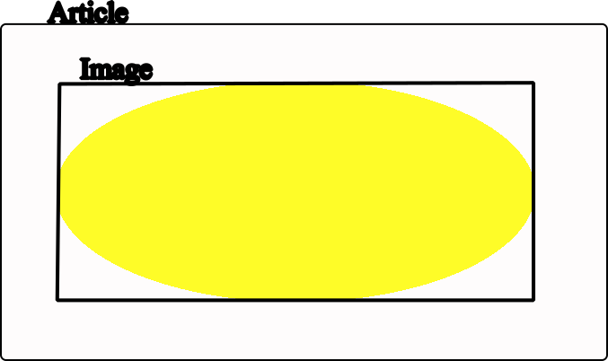
In Fig 1 above if the width of the article element is 600px and the width of the img element is 80% then the physical width of the img element 480px, i.e. 80% of 600. Similarly if the width of the article element was reduced to 400px then the width of the img element would be 320px.
<html>
<head>
<link href="PercentageResponse.css" rel="stylesheet" type="text/css">
</head>
<body>
<main>
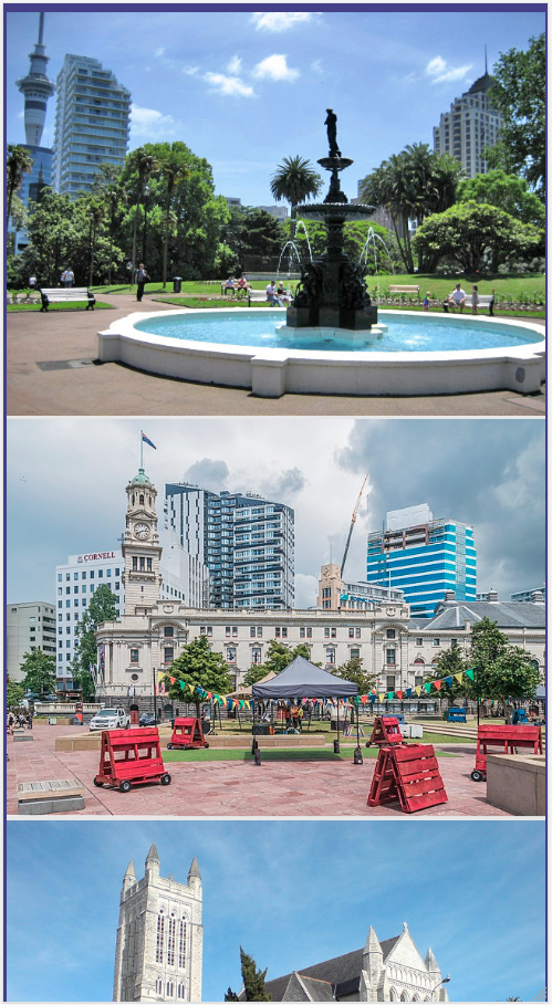
<h1>Aotea Square</h1>
<img src="AoteaSquare.jpg">
<p>Lorem ipsum dolor sit amet, consectetur adipiscing elit, sed do eiusmod tempor incididunt ut labore et dolore magna aliqua. Quis risus sed vulputate odio. Nisi est sit amet facilisis magna etiam tempor orci eu. Etiam tempor orci eu lobortis elementum nibh. Ut tristique et egestas quis ipsum suspendisse ultrices gravida. Sed faucibus turpis in eu mi bibendum. Amet purus gravida quis blandit turpis cursus in hac. Ac turpis egestas sed tempus urna et pharetra pharetra massa. Netus et malesuada fames ac turpis. Nunc consequat interdum varius sit amet mattis vulputate enim nulla. Tempor orci eu lobortis elementum. Arcu felis bibendum ut tristique et egestas quis. Cursus sit amet dictum sit amet. Sit amet mauris commodo quis imperdiet. Faucibus a pellentesque sit amet porttitor eget dolor.</p>
</main>
</body>
</html>
There is nothing to explain in Listing 1. It simply consists of a heading, an image and a block of text inside the main element.
                        body{
                            background-color: beige;
                        }
                        main{
                             padding: 0 30px;
                        }
                        img{
                            display: block;
                            margin:0 auto;
                            width: 30%;
                        }
                        h1{
                            text-align: center;
                        }
This is the CSS code for styling the HTML code in Listing 1. At first glance there is nothing unusual about it apart from line 10. Here the width of the img element is set to 30%.
Since the body and main elements have no width setting, they will take up the entire width of the browser window. This will result in the img element having 30% of the width of the browser window.
As the width of the browser window increases or decreases the width of the img element increases or decreases accordingly.
The above video shows the img element contracting along with the browser window
Go to topThe above example of responsive design works fine as long as all of the elements have a display with a value of block and are therefore placed neatly underneath each other.
Due to the huge variety of sytling facilities that CSS provides us with, web pages are rarely as simply laid out as the as the percentages application. One example of this is the Grid layout, which will be the basis of of our next example of Responsive Design.
<html lang="en">
<head>
<title>A well laid out page</title>
<link href="GridLayout1.css" type="text/css" rel="stylesheet"/>
</head>
<body>
<main>
<article>
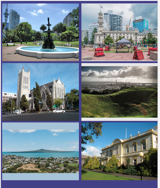
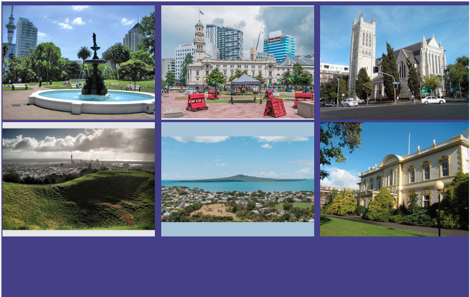
<img src="AlbertPark.jpg" alt="" class="first">
<img src="AoteaSquare.jpg" alt="" class="second">
<img src="StMatthewInTheCity.jpg" alt="" class="third">
<img src="CityFromMtEden.jpg" alt="" class="fourth">
<img src="Rangitoto.jpg" alt="" class="fifth">
<img src="GovernmentHouse.jpg" alt="" class="sixth">
</article>
</main>
</body>
</html>
The above code contains nothing new apart from the fact that each img element is assigned a class. We shall discuss those later when we discuss the CSS code.
It contains six images that we will try to arrange on a screen. How we arrange them depends on the width of our screen. Clearly we cannot arrange six images across a cellphone screen that has a width of 400 pixels.
How we arrange our images will be:
If there are more images and you have access to a very large screen you might add another media query to accommodate four columns.
We now look at how we will use CSS to style our layouts for us.
                            html{
                                font-size: 100%;
                                background-color: darkslateblue;
                            }
                            body{
                                width: 100%;
                                box-sizing:content-box;
                            }
                            *{
                                margin-left: 0;
                                padding: 0;
                            }
                            article {
                                width: 100%;
                                margin: 0 20px;
                                display: block;
                            }
                            img{
                                width: 99%;
                                max-width: 640px;
                                margin: 0 auto;
                            }
The above code shows the first third of the CSS file. It is similar to the CSS code that we have been using so far. There are a few items of interest that we need to point out however:
Below we see the images arranged according the the instructions in Listing 4-1
The width of the window in this case is 495px. After another 5 pixels it should tip over to a rearranged layout that will allow a two column display. This is what we are going to look at next.
Go to topWe have allowed the single column display to be applied to browser windows as far as 499 pixels wide. This is in order to accommodate the larger cellphones that may have a width greater than 400 pixels.
By the time the browser window reaches a width of 500 pixels it is time to look at accommodating the layout to a two column display. Enter the Grid layout!
                            @media screen and (min-width:500px){
                                article{
                                    display: grid;
                                    grid-template-columns: 48% 48%;
                                    grid-gap: 1%;
                                }
                                .first{
                                    grid-column: 1;
                                    grid-row: 1;
                                }
                                .second{
                                    grid-column: 2;
                                    grid-row: 1;
                                }
                                .third{
                                   grid-column: 1;
                                    grid-row: 2;
                                }
                                .fourth{
                                    grid-column: 2;
                                    grid-row: 2;
                                }
                                .fifth{
                                    grid-column: 1;
                                    grid-row: 3;
                                }
                                .sixth{
                                    grid-column: 2;
                                    grid-row: 3;
                                }
                            }
All of this code should be familiar to you apart from line 23. This is our first encounter with a media query and thus we need to go into some details about its conmponents.
The first component is the @rule which is @media. This is followed by the media-type which will be screen in our case. This means thar we shall be dealing with what appears on the computer monitor. (Another common media type is print)
The third component is media feature. In our case this is (min-width:500px). This means that the minumum width of the element in question is 500 pixels. In other words this applies to elements that are 500 pixels or more in width.
So if our window is 500 pixels or more in width, what happens to it? We shall explain below.
At line 25 the display property of the article element from Listing 3 is set to grid.
Line 26 specifies that the grid consist of two columns, each 48% of the width of the article element.
Lines 29 - 52 consist of six classes, each one specifying where each image from Listing 3 is to be placed on the grid.
Here we look at the final stage of rearranging the the images for a larger screen. The code below kicks in once the width of the window reaches 900 pixels.
                            @media screen and (min-width:900px){
                                article{
                                    display: grid;
                                    grid-template-columns: 33% 33% 33%;
                                    grid-gap: 1%;
                                }
                                .first{
                                    grid-column: 1;
                                    grid-row: 1;
                                }
                                .second{
                                    grid-column: 2;
                                    grid-row: 1;
                                }
                                .third{
                                    grid-column: 3;
                                    grid-row: 1;
                                }
                                .fourth{
                                    grid-column: 1;
                                    grid-row: 2;
                                }
                                .fifth{
                                    grid-column: 2;
                                    grid-row: 2;
                                }
                                .sixth{
                                    grid-column: 3;
                                    grid-row: 2;
                                }
                            }
The code here is very similar to that in Listing 4-2, with only very small changes. We will only discuss those same changes.
In line 54 the media feature has changed to (min-width:900px). This applies to screen widths of 900 pixels and upwards.
The next difference is that at line 57 the horizontal space is divided into three columns of equal width. This is also reflected in the classes that determine which item goes into what cell. Notice that at lines 69 and 81 the column count goes up as far as three while the row count goes only as far as 2.
Below is a demonstration of the number of columns increasing as the containing window gets wider.
Here we looked at two different ways of making the same web page adapt itself to different screen widths.
The simplest method was using percentages where all of the elements of a window would be scaled in proportion to the width of the same window. It has, however, a drawback that it can only be applied to web pages where all elements have a display value of block. It is not able to work in situations where elements have to be rearranged, depending on the width of the containing window.
The other option is to use media queries. This works differently to the percentage method. It selects a number of descrete widths from small cellphones to the large monitors and gives each width a different layout where each layout is the most appropriate for that particular screen width.
Go to topAs part of your exploration of responsive web design, this assignment allows you to demonstrate your understanding of key concepts. Your task is to explain in a clear and detailed manner the ideas discussed on the topic of responsive design. While you are not required to create an actual web page, you will write a narrative that showcases your comprehension of the content provided.
Begin by summarizing the importance of responsive design. Discuss why it is critical to design web pages that adapt seamlessly across various screen sizes, from 400px mobile phones to 5120px super monitors. Reflect on the challenges of designing for extreme screen sizes and the reasoning behind the suggested 1000px width limit for text blocks.
Next, explain the two main techniques used to achieve responsive design: percentages and media queries. Provide examples of how percentages can be applied to create fluid layouts, referencing how an image’s width adjusts relative to its containing element. Describe how this method is implemented and its limitations, particularly in more complex layouts.
Then, dive into media queries. Detail their structure and components, including the @media rule, media types, and media features. Discuss their role in designing layouts for specific screen widths, using examples like the transition from a single-column layout to two-column and three-column grids as screen widths increase. Highlight how grid layouts enable greater flexibility and control over the placement of elements.
Include in your narrative an explanation of CSS properties that are instrumental in responsive design, such as `grid-template-columns`, `max-width`, and `text-align`. Discuss their usage within the context of responsive web design, and provide scenarios where they might be applied effectively.
Finally, compare and contrast the two methods, percentages and media queries, emphasizing their respective strengths and limitations. Conclude with a reflection on the overall significance of responsive design in creating accessible, user-friendly websites.