Learning Outcomes
On completion of this page you will know how to arrange elements including text or images along a horizontal or vertical axis.
On completion of this page you will know how to arrange elements including text or images along a horizontal or vertical axis.
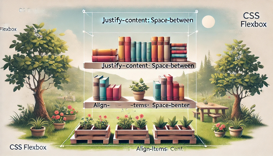
Flex is a layout system which can be seen as a companion to Grid. Their difference is that Grid is concerned with two dimensional layouts while Flex is concerned with a one dimensional layouts. These layouts can be either vertical or horizontal. For this reason it is very useful for styling navigation bars provided that they only contain a small number of links. Even in cases where the number of links get large, Flex can still help us to present a good menu system.
In this page we shall be looking at both horizontal and vertical layouts.
                        <html>
                            <head>
                                <link href="FlexRow.css" rel="stylesheet" type="text/css">
                            </head>
                            <body>
                                <header>
                                    <h1>Row flex-start</h1>
                                </header>
                                <main>
                                    <ul>
                                        <li>Good morning</li>
                                        <li>How are you?</li>
                                        <li>Good thanks, and you?</li>
                                        <li>Fine</li>
                                        <li>Cheers</li>
                                    </ul>
                                </main>
                            </body>
                        </html>
In Listing 1 above we have a simple example of a list of text items. Our goal is to arrange those short items horizontally across a navigation bar.
The .css file below in Listing 2 shows us how this is done.
                        h1{
                            font-size: 2rem;
                            text-align: center;
                        }
                        ul{
                            width:800px;
                            height:320px;
                            margin: 0 auto;
                            display: flex;
                            flex-direction: row;
                            justify-content:  flex-start;
                            list-style: none;
                            padding-left: 0;
                            border: medium solid black;
                        }
                        li{
                            border:thin solid black;
                        }
In Listing 2 you should already be familiar with how to style a main heading and how to specify width and height of an element as well as centering it within it's container. For this reason we shall skip to line 9 where we begin to analyse how our Flex works.
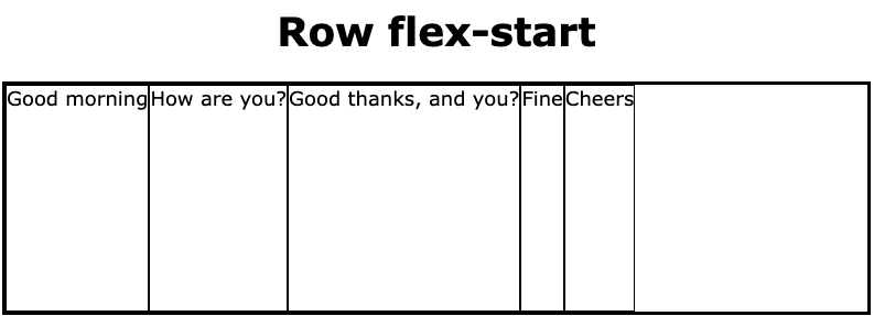
At line 9 the display of the ul element is specified as flex. Thus the ul element is now our navigation bar and using it's features we can specify how the li elements are arranged.
At line 10 the property flex-direction is set to row. This means that the li elements will be arranged horizontally across the navigation bar.
There a number of ways that we can arrange the li elements across the width of the bar and the property justify-content gives us a rich selections of arrangements for doing this. At line 11 it gives us the value flex-start. This means that all of the li elements will be pushed together at the left of the bar. This is shown in Fig 1 below.
Before looking at other options for arranging the li elements horizontally we shall first look at how we can arrange them vertically: again using the flex-start value of the property justify-content.
Go to top
                        <html>
                            <head>
                                <link href="FlexCol.css" rel="stylesheet" type="text/css">
                            </head>
                            <body>
                                <header>
                                    <h1>Col flex-start</h1>
                                </header>
                                <main>
                                    <ul>
                                        <li>Good morning</li>
                                        <li>How are you?</li>
                                        <li>Good thanks, and you?</li>
                                        <li>Fine</li>
                                        <li>Cheers</li>
                                    </ul>
                                </main>
                            </body>
                        </html>
Notice that Listing 3 above is almost identical to Listing 1. The only difference is in line 3 of both images; the .css file linked to Listing 3 is different from that linked to Listing 1. Here the file "FlexCol.css" styles the ul element so that it's contents run vertically instead of horizontallly.
The contents of the said file is shown below.
                        h1{
                            font-size: 2rem;
                            text-align: center;
                        }
                        ul{
                            width:800px;
                            height:320px;
                            margin: 0 auto;
                            display: flex;
                            flex-direction: column;
                            justify-content:  flex-start;
                            list-style: none;
                            padding-left: 0;
                            border: medium solid black;
                        }
                        li{
                            border:thin solid black;
                        }
Again we notice that Listing 4 is almost identical to listing 2 - apart from line 10. In the case of Listing 4 the value of the property flex-direction is set to column. This will result in the list items being arranged vertically as shown in Fig 2 below.
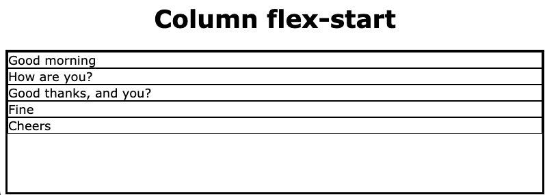
In Listing 4, line 11, justify-content is set to flex-start, just as it was in Fig 2. In the case of the column arrangement flex-start causes the li elements to be pushed up towards toe top of the column.
Go to topFor examining the effect of changing the value of justify-content to flex-end on the horizontal navigation bar we need to change a single line each in the files shown in Listing 1 and Listing 2.
First we change line 7 of Listing 1 to
<h1>Row flex-end</h1>.
This has no effect on the layout of the elements. It simply reminds the user that we are dealing with a horizontal navigation bar and the value of justify-content property.
In line 11 of Listing 2 we change the value of justify-content to flex-end. Now let us look at how this has altered the arrangement of the li elements in the horizontal navigation bar.
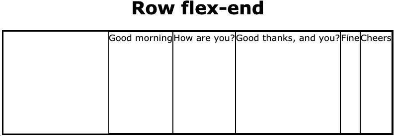
Changing the value of the property justify-content to flex-end results in pushing the list items to the right of the navigation bar.
First we change line 7 of Listing 3 to
<h1>Column flex-end</h1>.
As with the previous example this has no effect on the layout of the elements. It simply reminds the user that we are dealing with a vertical column and the value of justify-content property.
In line 11 of Listing 4 we change the value of justify-content to flex-end. Now let us look at how these alterations has affected the layout of our column.
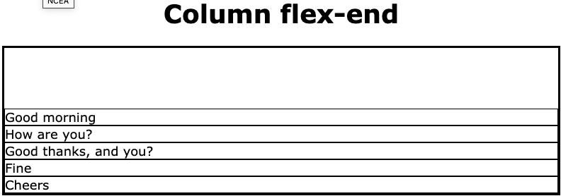
Setting the vaue of justify-content ti flex-end pushed all of the elements to the bottom of their container.
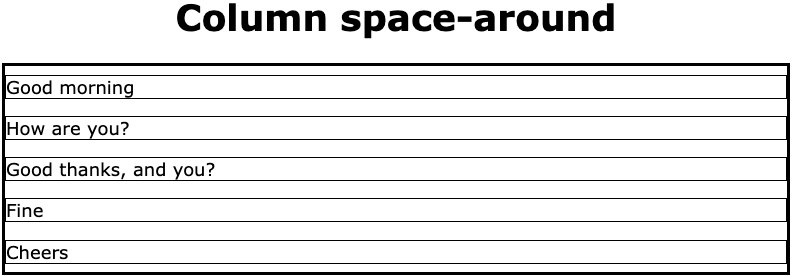
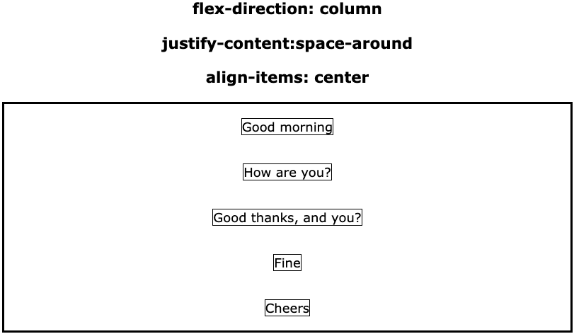
Go to topThis time we change line 7 of Listing 1 to<h1>Row space-around</h1>
and we change line 11 of Listing 2 to justify-content: space-around;
the result of making the change to Listing 2 is that the li system will divide up the free space on the navigation bar so that there is equal space between each two adjacent elements and half that space between the ends of the container and the first and last element.
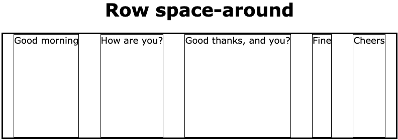
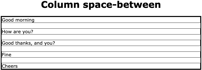
This is far more aesthetic than any of the previous arrangements. The algorithm for calculating the spaces between the li elements is as follows"
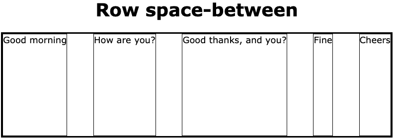
The space-between algorithm does not allow any space to the left of the first element or to the right of the last element. This means that the algorithm is very simple. The steps are as follows:
We can see that the same algorithm has been applied when the flex-direction has a value of column. Notice that there is no space above the first element or below the last element.
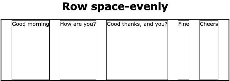
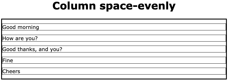
Go to topThe space-evenly algorithm arranges the li elements so that there is equal space between the ends of the navigation bar and the li elements themeselves. The algorithm is as follows:
The result of this can be seen in Fig 9 below.
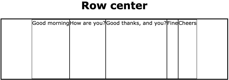
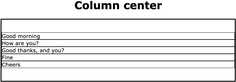
The property row-center is the easiest to implement, although not the most aesthetic. You simply divide the free space by 2, place one half at the start of the navigation bar and the other half at the end. The elements will fit between them in the centre of the bar.
If we look again at the odd-numbered images from Fig 1 to Fig 11 we see that each li element takes up the entire height of the horizontal navigation bar, and looks fairly ugly as well.
The reason for this fairly ugly arrangement is that up to now we were concentrating on how the property justify-content arranged the elements horizontally across the horizontal navigation bar if the value of flex-direction was row or vertically if the value of flex-direction was column.
Now that we have accomplished this we shall now look at how to arrange the elements vertically on the navigation bar in a more aesthetic way than being stuck at the top and their containing li stretching to the bottom of the bar.
In order to arrange the alignment of those li elements we need to use another flex property: align-items.
The values that the align-items property can take are: flex-start, flex-end, center and stretch. Of those set of values we have already encountered the stretch value. It is the default value of align-items. It's effect is to stretch the flex items from top to bottom of the containing navigation bar.
Notice in Listing 2 and Listing 4 that align-items is not used anywhere. When this occurs the default value of align-items is used. This happens to be stretch and it was automatically applied to all of our examples above. This is why the containers of the list items were stretched from top to bottom of the navigation bar.
Go to top
                        <html>
                            <head>
                                <link href="FlexRow.css" rel="stylesheet" type="text/css">
                            </head>
                            <body>
                                <header>
                                    <h3>flex-direction: row</h3>
                                    <h3>justify-content:space-around</h3>
                                    <h3>align-items: flex-start;</h3>
                                </header>
                                <main>
                                    <ul>
                                        <li>Good morning</li>
                                        <li>How are you?</li>
                                        <li>Good thanks, and you?</li>
                                        <li>Fine</li>
                                        <li>Cheers</li>
                                    </ul>
                                </main>
                            </body>
                        </html>
The above code varies only very slightly from that in Listing 1. That difference is that lines 7 - 9 have three level 3 headings describing the properties we will be applying to our flex container and the values of those properties.
                        h3{
                            font-size: 1.2rem;
                            text-align: center;
                        }
                        ul{
                            width:800px;
                            height:320px;
                            margin: 0 auto;
                            display: flex;
                            flex-direction: row;
                            justify-content:space-around;
                            align-items:flex-start;
                            list-style: none;
                            padding-left: 0;
                            border: medium solid black;
                        }
                        li{
                            border:thin solid black;
                        }
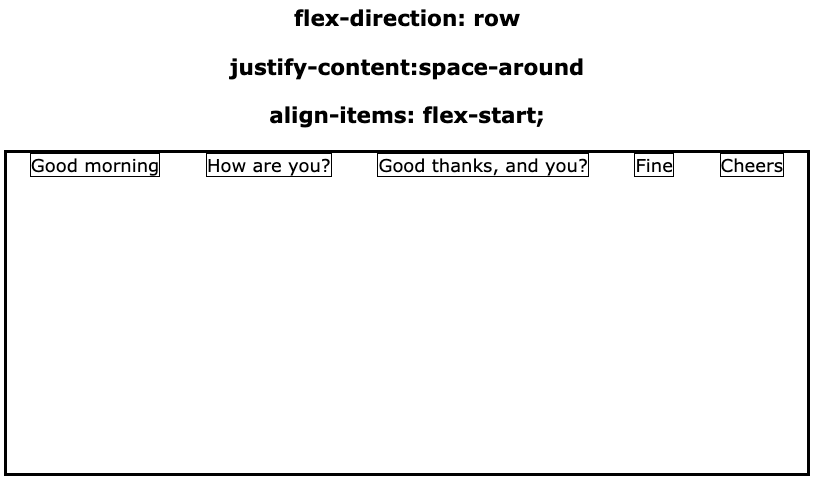
The css code shown in Listing 6 above is again similar to that in Listing 2 above. The difference is that we meet the align-items property for the first time. Here it's value is flex-start. This means that the flex items will be pushed up against the top surface of the navigation bar. This is demonstrated in Fig 13 below.
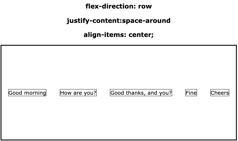
If we were to change line 12 of Listing 6 toalign-items: center
then we would get a display as in Fig 14 below.
Of the other possible values of align-items the effect would be as follows:
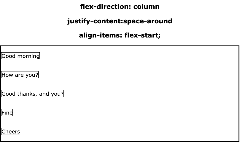
Here we shall look at how align-items work when flex-direction has a value of column.
Without the headings above the image we can still determine that justify-content has a value of space-around because the top margin is the same as bottom margin and both of them are half the size of the space between the individual flex items.
The align-items value of flex-start pushes the flex items against the left margin. (When flex-direction had a value of row they were pushed against the top margin.)
In Fig 16 below, the flex items are still arranged using space-around as they still have the same vertical alignment as in Fig 15. They are, however, centered due to align-items having a value of center.
There are no new concpets introduced here. This is simply applying what we learnt above to aligning images aesthecically inside a container.
                        <!doctype html>
                        <html lang="en">
                            <head>
                                <title>Flex 2D Centering</title>
                                <link href="Flex%20Column.css" rel="stylesheet" type="text/css">
                            </head>
                            <body>
                                <header>
                                    <figure>
                                        <img src="AucklandPanorama1.png" >
                                        <figcaption>Tamaki Makaurau from Devonport</figcaption>
                                    </figure>
                                    <figure>
                                        <img src="AucklandPanorama2.png">
                                        <figcaption>Tamaki Makaurau from Maungawhau</figcaption>
                                    </figure>
                                    <figure>
                                        <img src="AucklandPanorama3.png">
                                        <figcaption>One of Tamaki Makaurau's many beaches</figcaption>
                                    </figure>
                                </header>
                            </body>
                        </html>
At first glance the HTML code shown above looks quite different to the HTML code we have so far been using in this page.
The body consists solely of a header element, which will be our flex container. Enclosed inside the header are three figure elements; these will be our flex items.
Each figure encapsulates an image and a caption for that image. From this you may work out that flex items need not be sub elements of an unordered lists. It is a good idea, however that the flex items should be of the same type.
The rest of Listing 7 should be familiar to you so we shall not discuss it further.
                        header{
                            margin: 30px;
                            height: 700px;
                            border: 10px solid #c2aa8a;
                            background-color: beige;
                            border-radius: 5px;
                            width: 50%;
                            min-width: 900px;
                            padding: 40px;
                            margin: 0 auto;
                            display: flex;
                            flex-direction: column;
                            justify-content:space-around;
                            align-items:center;
                            list-style: none;
                        }
                        img{
                            width:100%;
                        }
                        figure>figcaption{
                            text-align: center;
                            font-size: 1.2rem;
                            font-weight: bold
                        }
Above is our CSS code for Listing 7. Down as far as line 10 there should be no unfamiliar code. Also lines 11 - 14 are identical to lines 9 - 12 of listing 6.
The only line we may need to comment on is line 18, where the images are assigned a width of 100%. Since the figure elements that contains the images have not been allocated a width value, they will assume the width of the containing header. Thus the images contained within the figure elements, will assume the width of their containing elements.
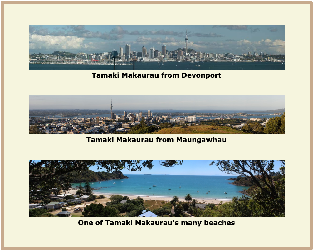
The images are aligned vertically using the space-around value of justify-content, and vertically using the center property of align-items.
Go to topSo far we have dealt with a horizontal navigation bars that had a small enough number of links to fit across the bar and have room to spare. Not every website is this small. Here we shall look at how to design a navigation bar with more links than can be accommodated on a single bar.
The HTML code below shows us such a bar.
                        <html>
                            <head>
                                <link href="Flex%20Big%20Menu.css" rel="stylesheet" type="text/css">
                            </head>
                            <body>
                                <header>
                                    <h1>Maori Myths and Legends</h1>
                                    <ul>
                                      <li><a href="">Home</a></li>
                                      <li><a href="">Rangi and Papa</a></li>
                                      <li><a href="">Voyage of Kupe</a></li>
                                      <li><a href="">Deeds of Maui</a></li>
                                      <li><a href="">Rural Legends</a></li>
                                      <li><a href="">The whale rider</a></li>
                                      <li><a href="">Tane related to Lu</a></li>
                                      <li><a href="">Tane the tree god</a></li>
                                      <li><a href="">Origin of taniwha</a></li>
                                      <li><a href="">Origin of the stars</a></li>
                                      <li><a href="">Tawhirimatea</a></li>
                                      <li><a href="">Who is Tangaroa</a></li>
                                  </ul>
                              </header>
                            </body>
                        </html>
This is a perfectly ordinary header which contains a Level 1 heading and an unordered list of hyperlinks. Our task is to provide an aesthetic display for such a large list.
                        header{
                            width: 900px;
                            background-color: darkslateblue;
                            border-top-right-radius: 20px;
                            border-top-left-radius: 20px;
                            margin: 0 auto;
                            height: 300px;
                            padding-top: 20px;
                        }
                        header>ul{
                            display: flex;
                            flex-direction: row;
                            flex-wrap: wrap;
                            justify-content:flex-start;
                            list-style: none;
                        }
                        header>ul>li{
                            width: 200px;
                        }
                        header>ul>li>a{
                            color: beige;
                            text-decoration: none;
                            line-height: 2rem;
                            border-radius: 5px;
                            margin: 5px;
                            font-weight: bold;
                        }
                        header>ul>li>a:hover{
                            background-color: beige;
                            color: darkslateblue;
                        }
                        h1{
                            font-size: 2rem;
                            text-align: center;
                            color: beige;
                        }
Of this fairly large piece of CSS the part that concern us here are lines 10 - 19. The newcomer here is line 13 where we introduce the property flex-wrap.
The flex-wrap can have one of three values:
In our case here we shall be using the wrap value, which means that once the row is full the elements wrap onto the next line.
The only other line we have to point out here is line 18. This sets the width of each li element to 200 pixels. This ensures that as the list wraps to the next line the elements will be positioned neatly underneath each other.

Above we see our list of 12 links neatly arranged in three lines of four columns each.
Go to topThe uploaded file provides a comprehensive guide to the CSS Flexbox layout, a powerful tool for creating responsive and dynamic web layouts. It begins by contrasting Flexbox with Grid layouts, emphasizing that Flexbox is suited for one-dimensional layouts, either horizontal or vertical, making it ideal for navigation bars and menu systems. The introductory sections outline the learning outcomes, including arranging elements along both axes.
The guide illustrates basic concepts with examples, starting with a simple horizontal flexbox where list items are arranged using properties like `justify-content: flex-start`. Similarly, it explores vertical arrangements, showcasing how Flexbox can adapt elements to vertical alignment by altering the `flex-direction` property. Throughout, the document includes annotated listings of HTML and CSS code, allowing readers to visualize and replicate the examples.
Advanced Flexbox properties are covered in detail, including `justify-content` values such as `flex-end`, `space-around`, `space-between`, and `space-evenly`, each with visual examples. These properties demonstrate how to distribute space among items effectively, either horizontally or vertically, in various configurations. The file also introduces the `align-items` property, which controls vertical alignment in horizontal layouts and horizontal alignment in vertical layouts, with options like `flex-start`, `flex-end`, `center`, and `stretch`.
Further sections delve into real-world applications of Flexbox, such as aligning panoramic images or managing large menu systems. The examples highlight how Flexbox can handle complex scenarios like wrapping elements into multiple rows using the `flex-wrap` property. The file also compares Flexbox's capabilities with Grid layouts, noting when each approach is more appropriate.
The guide concludes with practical insights and external resources, encouraging readers to explore deeper into Flexbox properties. Overall, it balances detailed technical explanations with practical examples, making it a valuable resource for understanding and implementing Flexbox layouts in web design.
Go to topIn this assignment, you are tasked with demonstrating your comprehension of the CSS Flexbox layout concepts detailed in the provided material. Using a flowing narrative style, reflect on and explain the principles, properties, and applications of Flexbox as discussed in the material. Focus on showcasing your understanding by providing examples, analysis, and connections between concepts. While you are not required to create an actual webpage, your narrative should reference examples and use descriptive explanations to convey your understanding.
Begin your response by introducing Flexbox, highlighting its primary focus on one-dimensional layouts and contrasting it with Grid layouts. Discuss how Flexbox handles horizontal and vertical arrangements, and why it is particularly suited for navigation bars and menu systems.
Next, explore the key properties of Flexbox, such as justify-content, align-items, and flex-direction. Describe their purposes and how their values, such as flex-start, space-around, or flex-end, influence the layout. Provide specific examples to illustrate their effects, including horizontal and vertical alignments.
Reflect on the practical applications of Flexbox, such as arranging large menus, aligning panoramic images, or creating dynamic layouts with flex-wrap. Use examples from the provided content to support your discussion and suggest scenarios where Flexbox would be the ideal choice over other layout techniques.
Finally, conclude by summarizing your understanding of the advantages and versatility of Flexbox. Consider its ability to create responsive and aesthetically pleasing layouts and how it complements other CSS layout methods. Reference additional resources if applicable and provide a thoughtful reflection on how Flexbox contributes to modern web design.
Ensure that your narrative demonstrates a deep engagement with the material, focusing on both theoretical understanding and practical insights. Your response will be evaluated on clarity, depth, and the ability to interconnect the concepts presented.
Go to top