Key competencies
Thinking
Go to top
Thinking
Go to topRegarding software being used, students are expected to know how to alter form control properties in order to implement error prevention and recovery
Regarding HCI students are expected to be aware of the concept of making software that enhances users’ productivity
Go to top#2: Match between system and the real world
#7 Flexibility and Efficiency of use
#8 Aesthetic and minimalist design
#10 Documentation
Go to topOn completion of this lesson you will know how to establish association between objects using both proximity and colour.
Go to topIn the previous chapter the form shown in Figure 8 5 is a big improvement on Figure 8 2. Despite this improvement we would regard Figure 8 5 as Yuck!
In this lesson we discuss the various design ideas that can be applied to the form so that it looks like the right-hand image and how those same ideas contribute to enhance its learnability and, and its usability.
Go to top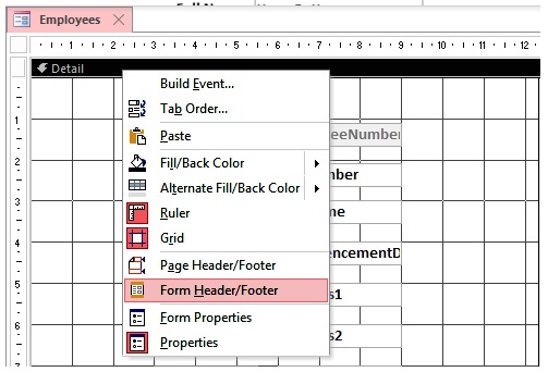
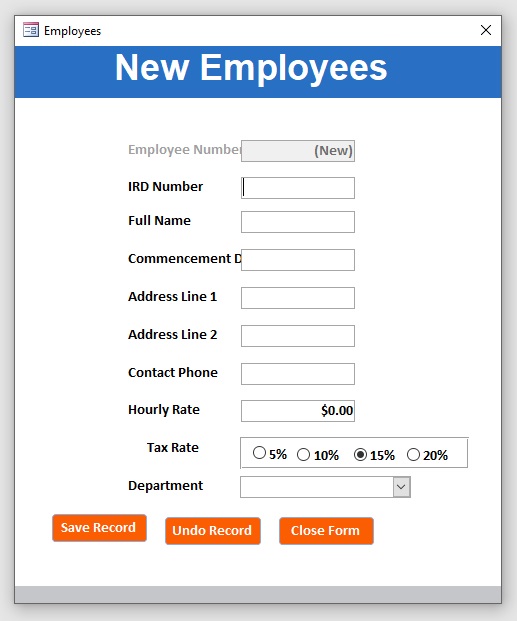
Although our form has all of the required controls for ensuring error free data entry, it is still lacking documentation and basic instructions as to its usage. Our first step in this direction is to add a header to it. A header to a form is like a front page to a book – it is the place where you put the title or main description of the form.
To add a header you ensure that you are in Design View and right click on the Detail bar as shown above. Next click on Form Header/Footer. This adds both a header and a footer. As we don’t need the footer we drag the base of the form up as far as the footer bar.
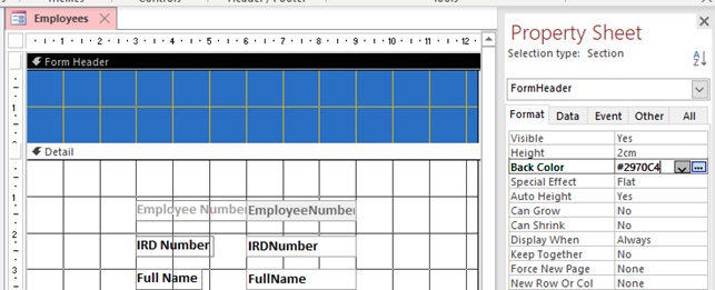
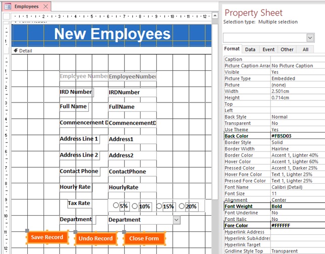
The only formatting we shall do with the header itself is to change its colour to medium blue. To do this you select the header area by clicking there and the bring up the Property Sheet as shown in Fig 2.
Here you give a value of #2970C4 to the Back Color property.
Our header does stand out now on the form due to its background colour, but for it to be of any use to us we must put a label there containing the title of the form.
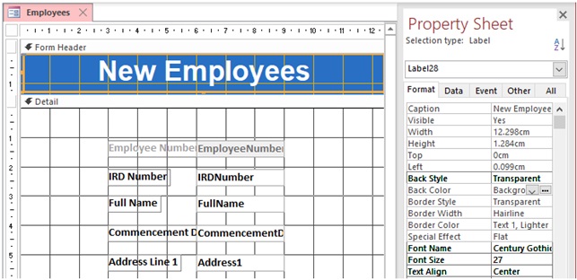
To create the label go to the Design Tab and in the Controls select Label. Once you draw the label, immediately enter the caption “New Employees”.
Next, ensuring that the label is selected, change the values of Back Style, Font Name, Font Size and Text Align as shown in Fig 3.
We now have a proper header for our form.
#2: Match between system and the real world
The text in the header clearly indicates that our form is for processing new employees coming into the firm. Real world wording is used and not technical jargon.
#8: Aesthetic and minimalist design
Our header text also comes under this heuristic, since there is no superfluous text to detract from the main message.
#10: Documentation
Despite being only two words long, this heading is also part of the documentation of the form, and in our case, is equivalent to the title of a document or chapter name in a book.
Further down this chapter we shall be looking at how we can make a self-documenting form.
To colour balance our form we shall add complimentary colour to our buttons. As all three buttons will be styled in the same way we can style them together as shown in Fig 4
#8: Aesthetic and minimalist design
Here the aesthetic applies more than the minimalist, since all we are doing here is making the form more interesting. Shortly, however, we shall be looking at how the colours contribute to the information flow of the form.
To enhance the legibility of the text we have used black text against a white background as the greatest possible contrast (Tidwell, 2010, p. 133). The other two colours used. blue and red are, along with black and white, among the six colours that most people can easily distinguish (Johnson J. , 2010, p. 61).
The black text and white background of the data entry controls and the white text and red background of the command buttons visually distinguish the two groups of controls from each other, thus making it clear that the two sets of controls have different functionality.
Go to top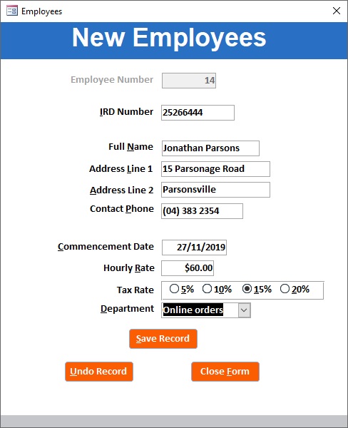
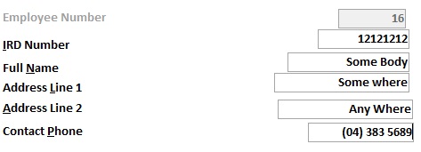
The data that we are entering about an employee can be divided into three groups as follows:
Looking at Fig 6 the IRD number is separated from the personal data by a wide vertical space while the name, address and phone number controls grouped together. This group in turn is separated by a wide vertical space from the controls related to the employee’s job. This proximity between items in a group and their slightly greater distance from other groups allow the users to easily distinguish the different groupings among the data items (Tidwell, 2010, p. 139) (Johnson J. , 2010, p. 11).
This physical and logical grouping of the data controls makes it easier for the user to know where in the form they currently are. This reduces the stress, which equally reduces the possibility of entering erroneous data, thus helping with error prevention.
#5: Error Prevention
By separating data into logical groupings, we are providing a more stress-free environment for the user to work in, thus eliminating error prone conditions.
#8: Aesthetic and minimalist design
Grouping related data items together and visually separating them from other groups, makes the form look more visually appealing, thus providing a less stressful environment for the user, which, as stated above, helps eliminate an error prone condition.
The fovea is the part of the eye that lies directly behind the pupil. It contains light receptors who then pass the light signals they receive to the brain. The centre of the fovea contains a high concentration of light receptors, which means that it gives us a very clear picture of what we are looking at. However, the concentration of light receptors decreases the further we move from the centre. This is our peripheral vision and is not anywhere near as strong as the detailed image we get from the centre of the fovea. A general illustration of the concentration of light receptors in the fovea is shown in Fig 7.
The result of the structure of the fovea is that we have very good vision at the centre of our field of vision but poor-quality vision at the edges. To measure how much of your field of vision lies within the fovea, simply hold your hand fully extended in front of you; the area covered by your thumbnail is approximately the same as the area of high definition vision of the fovea.
So why don’t we notice that most of our field of vision is out of focus, or else of very poor quality? The reason is that we move the centre of our eye over our range of vision so frequently that we get the impression that we are seeing a full picture of it all of the time.
So, what has this got to do with interacting with a computer?
To answer that let us look at a badly designed data entry form like the one shown in Fig 8 below. In this case it is impossible to focus on any of the data controls on the right and keep and keep the labels within any reasonable focus at the same time. They eye has to flick back and forth between the two of them. Result: eyestrain, stress, tiredness, loss of concentration, error prone environment.
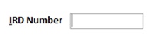
We can use proximity again to remedy this situation. This is achieved by moving each data control on the form and its associated label close to each other as shown in Fig 6. This is further enhanced by making the text in the labels right justified and that in the text boxes left justified so that the labels appear next to the data items they describe (Tidwell, 2010, p. 173) (Johnson J. , 2010, p. 14).
The close proximity of the label text to the data item being described means that both data and description, at least partly, lie within the region covered by the fovea, (Johnson J. , 2010, p. 65) and therefore minimum eye movement is required between them.
#5: Error Prevention
Labels separated from the controls that they describe by a large space require extra eye movement, waste of time and stress, thus leading to an error prone situation. This can be prevented by ensuring that the labels and the controls they describe are placed close to each other so that their relationship is unambiguously apparent.
#8: Aesthetic and minimalist design
Having data controls and their associated labels close together is the most efficient way of showing the relationship between them.
#10: Documentation
As long as the labels contain descriptive text, having them easily associated with their data controls enhances the documentation as the users can easily determine the functionality of the data controls.
Go to topWorkflow in the form should begin at the IRD Number textbox and moves vertically down to the Save Record button, which saves the data entered. This corresponds to the human perception of reading top to bottom. In order to facilitate this the IRD Number textbox should have the focus once the system creates a new record.
All of the data controls from the IRD Number down to the Save Record button have a Tab Index from 1 up to 10 and thus by pressing the Tab key the user can navigate sequentially through all of the controls (Johnson J. , 2010, pp. 99, 100).
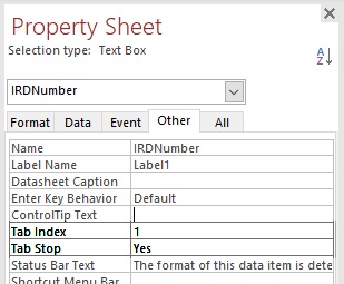
Fig 9 shows how to set the Tab Index and Tab Stop properties for the IRDNumber textbox. They should be set sequentially for all of the other data controls down as far as the Department combo box.
#2: Match between system and the real world
The top to bottom flow discussed here follows real world conventions of working sequentially through data items.
Go to topMany users, especially poor typists, prefer to use the mouse in order to navigate a form. Others, for a variety of reasons – including health, prefer to use the keyboard exclusively. For those users we must provide facilities for selecting random controls on the form without having to continuously press the Tab key until they reach the required control (Cooper, Reimann, Cronin, & Christopher, 2014, p. 468). Two things need to be done in order to achieve this.
The first one is to make the Save Record button the default button (Cogswell, 2004, p. 27). This is easily achieved by changing the Default property of the button to True. Once this property is set, pressing the Enter key is the same as clicking on the Save Record button.
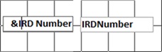
The other one, which takes much longer but which is quite easy, is to provide a shortcut to each of the form’s controls. Notice in Fig 6 that each of the labels of the data controls have one of their letters underlined and that the three buttons also have one letter of their captions underlined. (Underlining a single letter of a label or a button caption is very simple; in design view just put an ampersand in front of it.) To activate any control on the form simply press the Alt key followed by the underlined letter.
Fig 10 above shows the label of the IRDNumber field being edited by placing an ampersand in front of the initial I, while the next illustration shows the same field in Form view, with the same initial I being underlined.
These features make the form highly navigable. Using the Tab key the user can move from the IRD Number textbox down as far as the Save Record button, while if they wish to return to any of the other fields or activate a button command they simply used the Alt key and the underlined letter (Cogswell, 2004, p. 112).
#7: Flexibility and efficiency of use
If confined to using the Tab key, keyboard users would be forced to move sequentially down the form (or using Shift + Tab move backwards). However, using shortcut keys users have the same freedom of movement around the form as mouse users
Go to topStairs and ladders afford vertical self-propulsion, cups afford drinking from and bicycles afford cycling. In the digital world text boxes afford entering data and command buttons afford clicking (Norman, 2013).
Signifiers indicate what actions can be performed on an object and how. The caption of a command button signifies what happens when you click on the button while the caption of a label-textbox pair signifies what is to be entered into the textbox.
Similar comments apply to radio buttons and combo boxes.
In the form the affordance of the objects and their signifiers contribute to the form’s learnability.
Menus should explain the scope of the system (Cooper, Reimann, Cronin, & Christopher, 2014, p. 450). According to this a user, by examining the captions on the command buttons should be able to work out what functionality the form is capable of. In Error! Reference source not found. our three buttons have the captions ‘Save Record’, ‘Exit Form’ and ‘Undo Record’. This discriptive text should make it clear what exactly we can and cannot do with our form.
The labels of the data controls explain clearly what data the controls hold and the proximity of the labels to their controls avoids any ambiguity regarding which label is describing which control. With this clear signage users know where to go and don’t have to waste time deciding what action to take next (Tidwell, 2010, p. 78).
If users need further information regarding the functionality of a control or which data to enter where, tooltips can be used (Cooper, Reimann, Cronin, & Christopher, 2014, p. 457). The big advantage of tooltips is that you can be as verbose as you want – up to a point – because they only take up screenspace when the user hovers over the appropriate control.
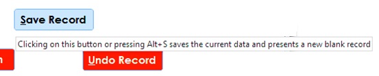
Fig 12shows the tooltip for the Save Record button. This verbose tooltip explains both how to use the button and what actions are performed on the button click. See more examples of it in Figure 6 14 and Figure 6 15.
Allowing the user to play with the system is the best way for them to learn it. However the user must be provided with an escape hatch to prevent inaccurate data entering the system (Cooper, Reimann, Cronin, & Christopher, 2014, p. 450). In our case the Undo Record button, which cancels all of the current data that has not been saved, provides this learning facility to the form.
Go to topTo enhance the usability of the form high contrast colours were used to enhance legibility of text while proximity was used to indicate logical grouping of objects and to associate textboxes and their accompanying labels. The top-to-bottom sequence towards the Save Record button provided an information scent and for random accessing of objects shortcut keys have been provided.
To make the form self-explanatory the wording of labels and button captions were chosen carefully, and tooltip text were provided for most objects.
Finally the Undo Record button allow users to experiment with the system without having to commit their data to the database.
Go to top