Key Competencies
Thinking, contributing
Go to top
Thinking, contributing
Go to topThe students will already have created a table according to the specifications of the conceptual model.
Go to top#1 Visibility of system status
#2 Match between system and the real world
#5 Error Prevention,
#6 Recognition rather than recall,
#8 Aesthetic and Minimalist Design,
#9 Help users recognize, diagnose, and recover from errors
Go to topAt the end of this lesson you will know how to reduce error situations by:
When we looked earlier at the conceptual model we specified a number of restrictions on the data that could be entered into our table. Some of those restrictions are:
Recall that the EmployeeNumber field is an AutoNumber, which means that it automatically increases by 1 each time a new record is added. This means that only the system is allowed to put value into this field, while the user is blocked out.
Although a user may inadvertently try to enter data into the field the system will reject it. It is however better if we totally disable the user from ever entering this field. The way we do this is to disable the field on the form.
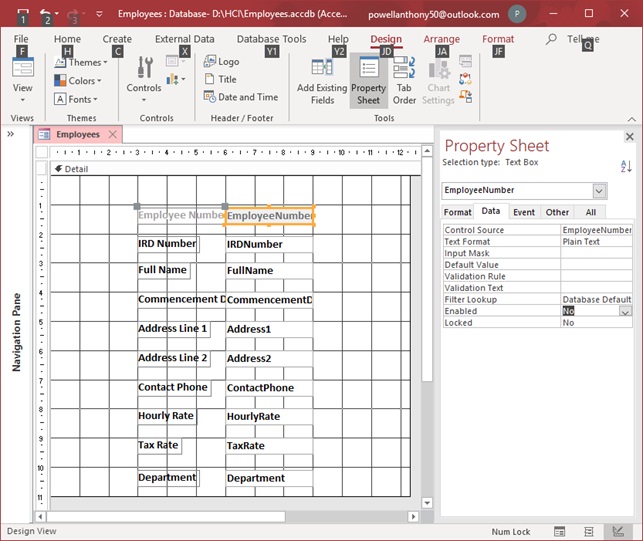
Above we see how to disable a field. Firstly, in the Design tab, the Property Sheet panel must be selected. Next the EmployeeNumber field on the Form is selected and in the Property Sheet panel the Data tab is selected, as shown in Fig 1. The field’s Enabled property is then set to No.
Once this is done the EmployeeNumber textbox and its associated label are greyed out emphasizing the fact that it cannot be accessed either using the keyboard or the mouse.
Most computer users are accustomed to recognizing that greyed out elements are not available to them.
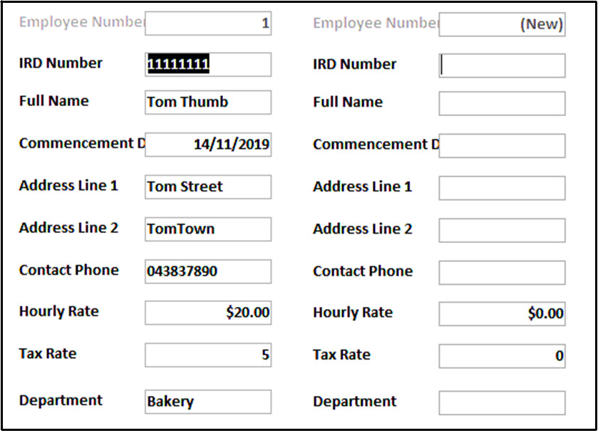
Above we can see the effect of disabling the EmployeeNumber field. In the left image the existing record shows the EmployeeNumber field as being greyed out, while in a new record where no data has yet been entered the greyed out EmployeeNumber field shows the default value Data. As soon as the user enters a value in any of the other fields the EmployeeNumber field’s value will change to be one more than the last EmployeeNumber value.
The heuristics involved here are and #8 Aesthetic and Minimalist Design. Minimalist design involves not having any unnecessary controls on the form. Strictly speaking the EmployeeNumber field should be left out of the form since the user can never access it anyway. On the other hand when the user is on a new record where no data has been entered yet the (New) value in the EmployeeNumber field clearly indicates that this is a brand new record which contains no data. Thus the internal status of the system can be seen by the user.
Recall that we are using heuristics here and not rules. Heuristics are general and very flexible guidelines which may appear to contradict each other. However, their flexibility allows us to disable the field so that its clearly inaccessible to the user thus partly obeying the Minimalist Design heuristic and at the same time having it visible shows the user the status of the system, i.e. whether this is an existing record or a brand new one.
Go to topIn the conceptual model the IRDNumber field was specified as being text but containing numeric characters only.
Despite having to make two changes here, i.e. confining the length of the field to eight characters and ensuring the each of those characters are numeric we can apply both restrictions with only one modification.
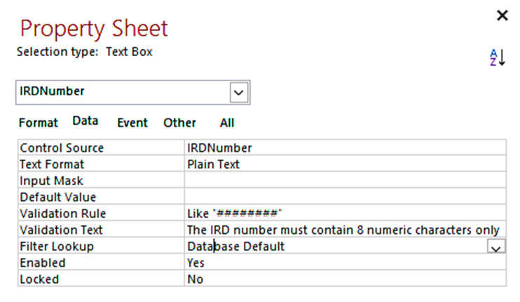
As always, we must first select the field to be modified, IRDNumber in this case. In the Property Sheet we select the Data tab. Here we have to modify two of the Data tab’s properties: Validation Rule and Validation Text. In the Validation Rule we have as property the very cryptic Like “########”. The rule is interpreted as follows: each of the hash signs, ‘#’, must be replaced by a numeric digit in the range 0 – 9. As there are eight hash signs the user must enter eight digits. Thus, this clever rule manages to restrict the size and the content of the value that goes into this field.
This is fine, but what happens if the user enters alphabetic characters or else attempts to enter either less than or more than eight characters. In this case an error occurs and the value of the Validation Text property is displayed.
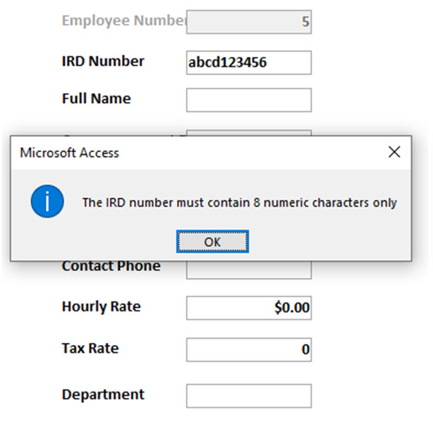
Fig 4 above shows the result of entering wrong data in the field. Notice that the error message is exactly the same as the value of the Validation Text property of the IRDNumber field.
Two heuristics are used here #5 Error Prevention and #9 Help users recognize, diagnose, and recover from errors. The value of the Validation Rule prevents the user from entering non acceptable data into the field thus complying with Error Prevention. Meanwhile if wrong data is entered the error message clearly tells the user what went wrong and how to fix it, thus complying with Help users recognise, diagnose and recover from errors.
Go to topThe data meant to go into this text box is the date that the employee started working with the firm. The text box must therefore be signified as being of type Date. As a date it can potentially cause great problems. The reason for this is the variety of ways a date is presented. As an example, the first day of the month of August, 2019 can be written as 1/8/2019, 8/1/2019, 1-8-19, Thursday 1st August 2019… and the list goes on!
How a date is interpreted by a computer depends on both the operating system itself and the software that is using the date. This should be a nightmare for any form designer!
Wrong! For once MS Access comes triumphantly to our aid with its date picker or calendar object. Once the date field gets the focus a calendar icon appears beside the field as shown in Fig 5.
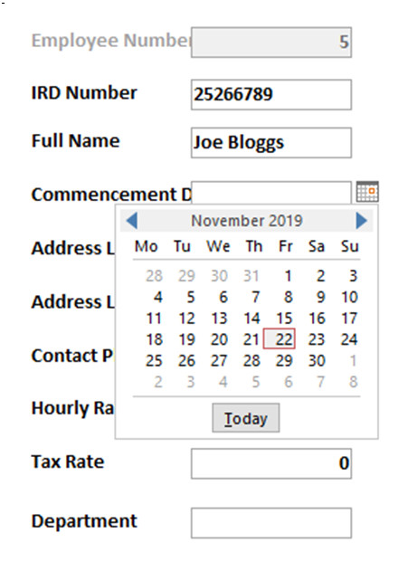
Since we have declared the field CommencementDate as of type Date/Time, Access automatically provides a date picker for us, whether we are entering data directly into the table itself or using a form to enter it. Once we click inside the CommencementDate field a calendar, or date picker to give it its official term, appears. Here we simply pick a date from the calendar’s page without having to worry about it’s internal formatting within the system.
#2 Match between system and the real world and #5 Error prevention.
This feature of adding items from the non-digital world to a form is Nielsen’s second heuristic: Match between the system and the real world. In the non-digital world, we are familiar with calendars and have always known how to use them. Bringing them into the system here allows the user to manipulate an object that they are familiar with in the physical world and thus make their work more satisfying and less tiring. Also, it frees the user from fretting about the variety of date-presenting conventions both in the real world and their implementation within the computer system. This also enhances the learnability of the system.
Since entering dates into a system can be so error prone, as discussed earlier, using a date picker also prevents date formatting errors to occur thus complying with the second heuristic of Error Prevention.
Go to topPhone numbers consist of a long list of numeric digits. Lengths of numbers vary depending on whether you are using:
Whichever the case, we are dealing with a long number. Long numbers such as phone numbers, bank account numbers and tracking numbers pose problems if we are trying to copy them or key them into a device. The reason for this is our short-term memory. That part of our memory can hold data for only one or two seconds. For this reason, it is impossible for anyone to recall a 10-digit number after 2 seconds.
Shorter numbers, however, are easier to memorise. This is the reason that credit card numbers are displayed as four sets of four digits. 4882 9663 7872 6653 looks like a typical credit card number. It is very easy to copy because you can hold each four-digit chunk in memory long enough to copy it down.
Back to our phone numbers. They can present the same problems as credit card numbers, but we can solve the problem in the same way as we do with credit cards – we break them into chunks.
We break the phone numbers into different types of chunks to our credit card. In our example here we shall use just use a two-digit area code and a seven-digit local number. We shall break this up as follows:
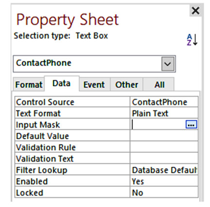
In order for the system to provide the brackets and the spaces between the numbers we use an input mask. The steps for using this is first to select the ContactPhone textbox on the form and in the Property Sheet select Input Mask as shown in Fig 6.
We now click on the tiny icon on the far right of the Input Mask row. This brings up the first stage of the wizard shown in Fig 7.
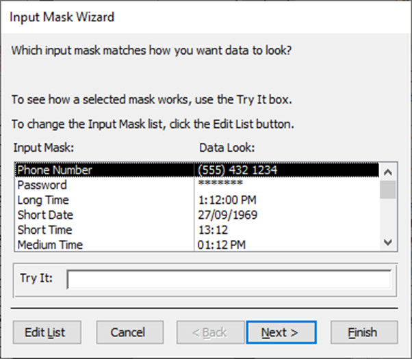
The wizard here provides a list of generic template masks for different types of data: phone number being one of them. The example here is almost perfect for us except that there are three digits between the brackets instead of the two that we require.
We need to edit the generic phone number to remove one of the numbers between the brackets. To do this we ensure the Phone Number is the selected item on the list and then click on Next. This gives us the next stage of the wizard as shown in Fig 8.
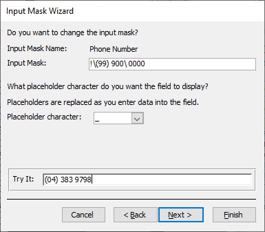
Here we edit the textbox labelled Input Mask to remove one of the digits between the brackets, thus leaving only two. That is all of the editing we have to do. To make sure we have edited the mask correctly we can try out a sample phone number at the bottom of the dialogue box. If this formats correctly we can click on Next to go to the last part of the wizard which is shown in Fig 9.
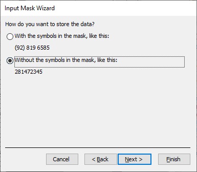
Here we are give the option of storing the data with or without the mask symbols. It is best to store it without the symbols since this gives us the opportunity of reformatting it later on if we wish. To complete our wizard we click on Finish.
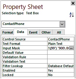
Once we close the wizard, our input mask now appears in the Property Sheet as shown in Fig 10 above.
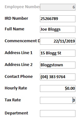
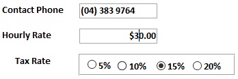
Here we see the form in Form View. Notice how the phone number 043839764 has been formatted in the ContactPhone textbox.
The input mask is quite powerful and performs very thorough error prevention. For example, entering more than the 9 characters allowed is no problem; it simply stops at the ninth character. Entering text instead of numeric characters does not cause any problems either – they are simply ignored.
However, if the user exits from the field without completing all of the digits, the system throws the very unfriendly message shown below. This is one of the drawbacks of the mask.
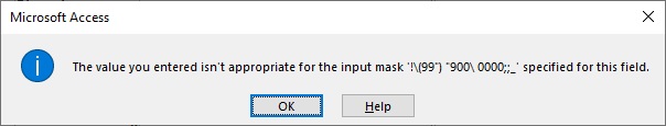
Like many of Access’ error messages, this is rude and is of no help at all regarding correcting the error. It does not say exactly what the user did wrong or how to go about correcting the error, thus leaving the user both confused and irritated. This type of error message should be avoided at all costs.
Again, the heuristics used here were #5 Error Prevention and #9 Help users recognize, diagnose, and recover from errors.
As stated above the input mask is very good at error prevention, and Error Prevention is very well catered for. The user, however, cannot provide their own error message if too few characters are entered. The system must therefore rely on one of Access’ standard messages, which, as we said earlier is very rude and unhelpful and therefore the heuristic Help users recognize, diagnose, and recover from errors goes by the board here.
Go to topIn the conceptual model we stated that this must be a number between 20 and 80, i.e. the lowest and highest hourly rate the company offers. We must therefore constrain the values entered into this field to these limits.
Fig 13 below shows how this is done. The Validation Rule of the field has been set to >=20 and <=80
In English this translates as greater than or equal to 20 and less than or equal to 80. Any number outside of those constraints will be rejected.
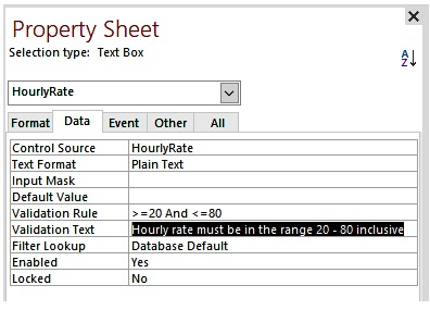
Notice also that as well as the validation rule, we have a Validation Text as well. The value of this property, which is which is shown in Fig 13, is the text of the error message that will be displayed if the user enters a number outside the range 20 – 80.
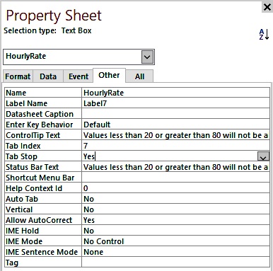
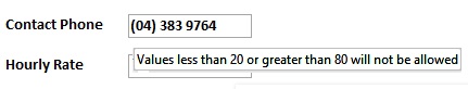
Another problem here is that the user probably may be not aware of the restrictions on what is allowed into this field. Therefore, to give them some guidance we can give the textbox a tooltip. Below in Fig 14 we see how the tooltip is implemented. In the form, when the user hovers over the textbox the tooltip is revealed as shown in Fig 15
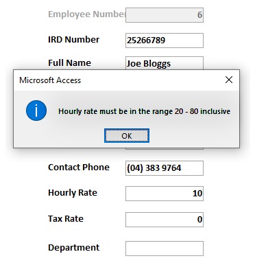
Above in Fig 16 after the user had entered a number outside of the given range, an error message is raised showing the contents of the Validation Text property. You can clearly see behind it that the user entered 10 for the value of the hourly rate.
Here the system is being very generous with the user. The label clearly indicates what data is to go into the textbox, the tooltip indicates the range of values that are allowed and if all else fails the error message explains in plain English what went wrong and how to fix it. This respectful and helpful interaction will contribute towards a good user experience (Cooper, Reimann, Cronin, & Christopher, 2014, p. 457).
Again, the heuristics used here were #5 Error Prevention and #9 Help users recognize, diagnose, and recover from errors.
The Error Prevention here is very efficient since the validation rule will not allow the user out of the HourlyRate textbox until a value in the appropriate range is entered.
The heuristic Help users recognize, diagnose, and recover from errors is also very well served here. The error message generated by the Validation Text property explains both what went wrong and how to fix the error. This is supplemented by the ControlTip Text which informs the user of the data range required before the user actually focuses on the field.
Go to topIf we want only one of the values of 5, 10, 15 and 20 then we cannot use the validation rule >=5 And <= 20.
This is because this rule will allow such values as 6, 8 14, 16.5 etc. In other words the Validation Rule works on a continuum. On the other hand if we want those four multiples of 5 we have to turn to radio buttons.
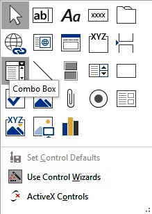
To create a set of radio buttons we have to go to the Design tab and select Controls. This will give us a set of control icons as shown below.
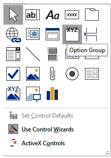
From those controls we select the Option Group. Once we select this a wizard appears automatically, the first dialogue box of which is shown in Fig 18.
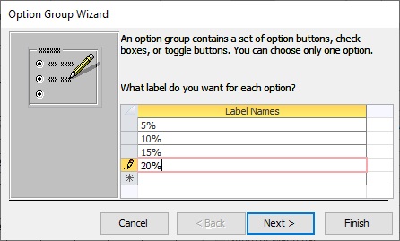
This dialogue box allows us to specify the four labels for our four radio buttons. Once we are finished, we click Next to go to the next dialogue box.
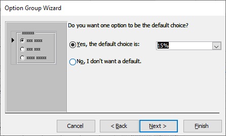
This dialogue allows us to specify a default value for the group, in our case one of the four allowed values. You may choose a default or else ignore it and click on Next
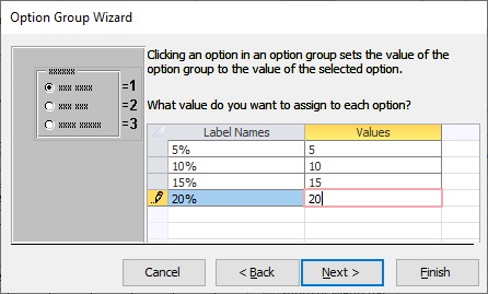
You cannot ignore this dialogue. Here you must specify the values that are to be attached to each of the four radio buttons.
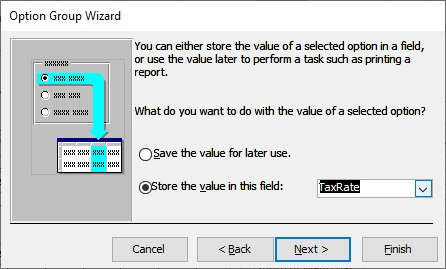
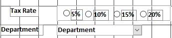
Here you choose which field you want the values of the radio button group to go into. In our case it is going to be the field TaxRate. Because of what we specified in Fig 20 the possible values for this field will be 5, 10, 15 or 20, depending on which of the radio buttons you press.
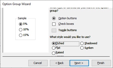
This dialogue will always have a value of Option buttons, so you simply click on Next.
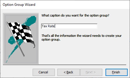
Finally this allows you to specify what is to appear on the radio button group label – Tax Rate in this case – and then you click on Finish. This will put on your form the horrible display shown in Fig 24
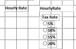
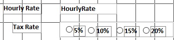
However, by dragging and dropping the controls and resizing the option group itself you get the much nicer arrangement shown in Fig 25. If we go into Form View we see a neatly laid out set of radio buttons.
#2 Match between system and the real world
The term radio button derives from the push buttons on old fashioned radios where pushing one button released whichever button was previously pressed. The radio buttons on a form behave in a similar manner; if one button is selected, whichever button was previously pressed is deselected.
#5 Error Prevention
Since there is no keyboarding involved in entering a value for the tax rate, the user is forced to use one of the radio buttons. Therefore, entering a wrong value is very difficult.
#6 Recognition rather than recall
This means that when the user is entering employee data, when it comes to entering the tax rate value, the user does not have to check up which values are allowed since all of the allowed values are displayed in the option group.
Go to topRadio buttons, as we have seen above, are very good at preventing input errors and are a very convenient and intuitive device for presenting a small number of choices to the user. However, if the number of choices is large you still need one button per choice and thus, they can take up a large amount of the screen space. When this occurs, it is best to use a combo box control.
The name combo box derives from the fact that it is a combination of a textbox and a drop-down list. Normally it takes up the screen space of a single textbox but when we wish to use it we click on the down arrow in its right hand corner which allows the drop down list to expand. Simply selecting an item from this list causes the combo box to collapse back to a single text box again.
To create a combo box we have to go to the Design tab and select Controls. This will give us a set of control icons as shown below. From those we select Combo Box.
Once we create a combo box on our form a wizard appears automatically to allow us to configure it, as shown below.
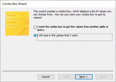
In a more advanced course, we would have the combo box reading data from another table, but here we will simply supply it with our own list, which we shall type in ourselves. For this reason, we will select the second option and then click on Next.
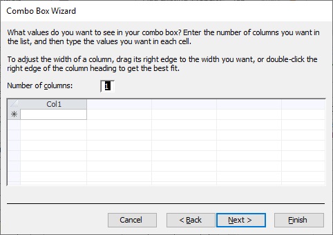
A combo box can have multiple columns of data, but here we only want one column. Therefore, we will leave the default value of one column as it is and then click on Next.
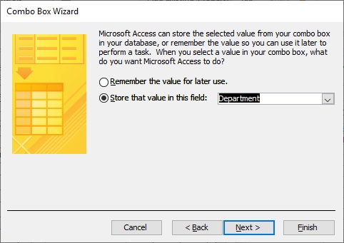
Here we specify in which field of our table will the data from the combo box be stored. Since the values we are going to enter are the names of the departments, obviously we will store the box’s data in the field Department.
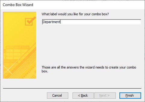
Finally, we are asked to give a name to the label attached to our combo box and, of course, the obvious name is Department.
Once we click on Finish the combo box appears on our form as shown below.
We have not entered any data into the combo box as yet. To do this we ensure that the combo box is selected and then go to the Property Sheet.
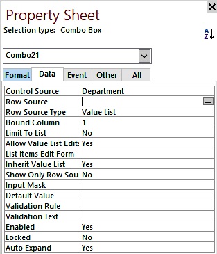
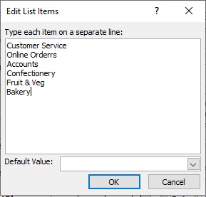
We go to the Data tab and select the icon at the far right of Row Source. This brings up the input box shown below in Fig 34. Here we enter the names of the various departments and then click on OK. Our combo box now has values that can be stored in the Department field.
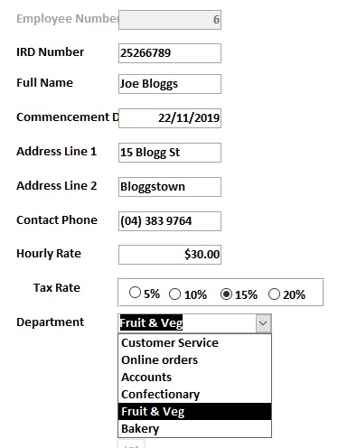
Finally, we have our completed form as shown in Fig 35. From its drop-down list Fruit & Veg is selected, which means that for the employee Joe Bloggs, he is assigned to work in the fruit and vegetable section of the supermarket.
#5 Error Prevention
The combo box is almost as good as the radio buttons at error prevention. This is because the user input is confined to the values assigned to the combo box. The combo box, however, is flexible enough that if we wish we can allow the user to enter data other than what is in the drop-down list.
#6 Recognition rather than recall
During data entry, rather than having to remember or recall the name of each department within an organization, the user can simply scan the drop-down list or the appropriate name.
#8: Aesthetic and minimalist design
Compared with radio buttons, combo boxes save considerable amount of screen space by having all of their option hidden until we need to access them. As well as saving on screen space it also makes the screen less cluttered, and therefore easier to navigate.
Go to topWhen we looked at the conceptual model we specified a number of restrictions on the data that could be entered into our table. Some of those restrictions are:
These restrictions were implemented in the form by:
These restrictions were implemented in the form by: