On completion of this module you will know how to:
develop a colour palette that will allow people with low vision to read and interpret text.
format page widths to avoid long lines of text
use online apps that can determine the contrast between any pair of different colours
Introduction
In the previous section, when we were building our web page we concentrated solely on making the page accessible to the blind but paid no attention to how the page would look to a sighted person.
With the page now optimised for screen readers we will look at modifying the page for the benefit of sighted readers, especially those with learning difficulties.
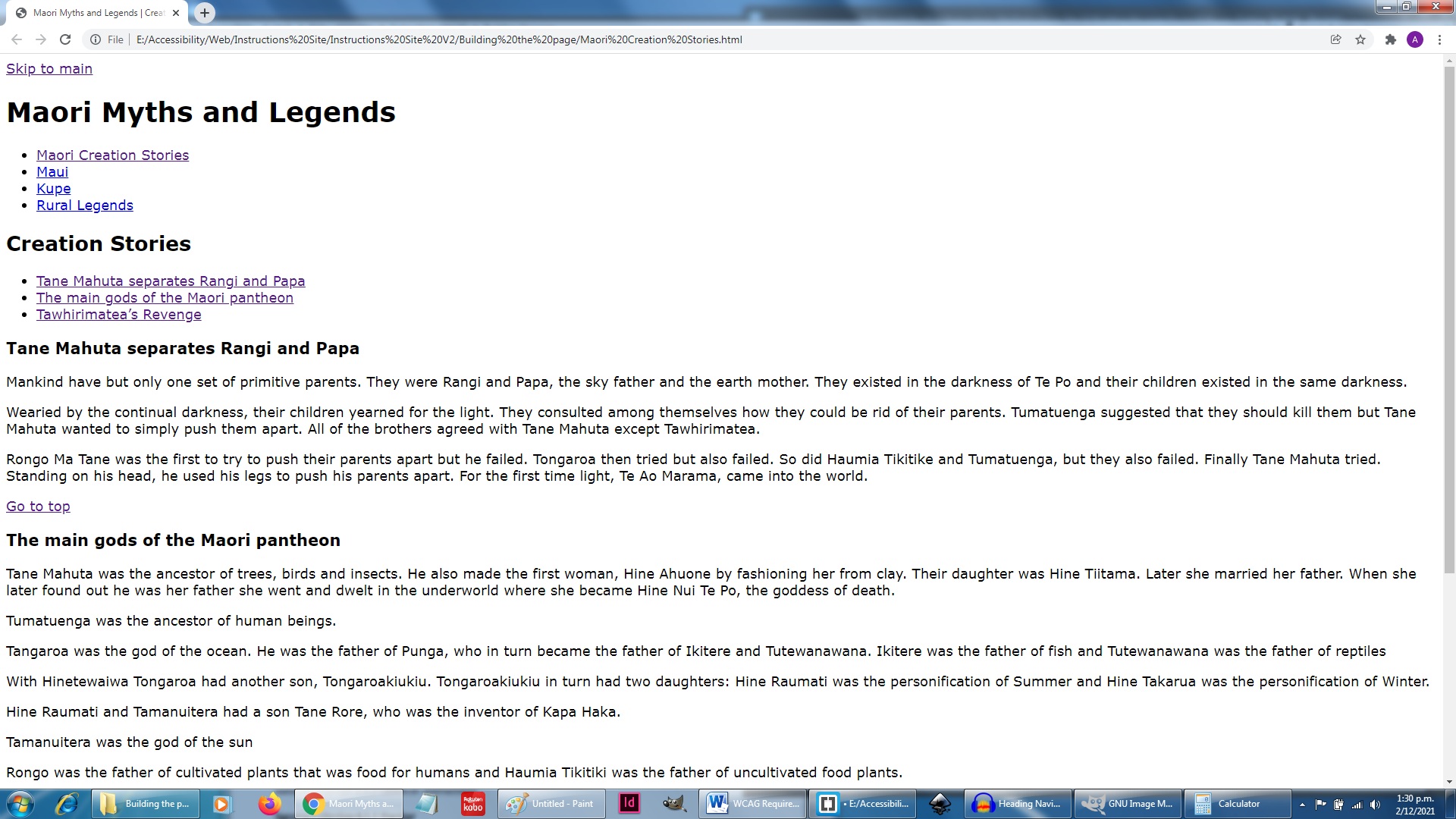
Fig 1: Text on full width screen is difficult to read
As can be seen above a sighted person can still read the page as all of the text are visible. It does, however, make uncomfortable reading for a number of reasons:
the lines of text are very long, and dragging your eyes back to the start of a new line can be tiring.
The white background may be too bright for people
The size of the text may be too small for those with poor vision
We shall leave the text for another page, but here we shall be looking at resizing the pages in order to get a better text presentation, and also using colour to make the text more accessible to people with various cognitive impairments.
To apply shape and colours to our page we shall not interfere any further with our html file. Instead we shall create a Cascading Style Sheet file. Since it will predominantly be used to control the colouring of our html file we shall name it Colours.css.
The code snippet above are the first six lines of our Maori Creation Stories.html file. Line 5 shows the syntax for attaching our Cascading Style Sheet file, Colours.css to it.
Now that we have attached a blank CSS file to our HTML file, let us look at how we put styling instructions into that file.
/***************************************************************The only thing we specify for the <body> is the background colourThis has been specified as a codeght grey since we do not want strongcolours competing with the page's main content.****************************************************************/body{ background-color: #eee;}
Blank white backgrounds may appear dazzling to many to people with vision problems. We cannot however replace them with patterned backgrounds or other strong colours as they may be detracting from the page's main content and may be a barrier to people with cognitive issues such as those on the autism spectrum[1][2].
In Listing 2 above line 7 sets the background-color attribute of the <body> block to #eee which is a light grey.
With this level of formatting our page would look identical to Fig 1 above except that instead of pure white the background would be light grey.
/****************************************************************HEADERIn this series of blocks we specify the different format styles that are appcodeed to either the <header> itself or else some of the components inside the header*****************************************************************//****************************************************************<header>, <main> and <footer> are included here because they have some common features such as width and their placement within theweb page. They also behave in identical manner if the width of thebrowser window is changed******************************************************************/header, main, footer{ width: 100%; max-width: 900px; min-width: 400px display: block; margin-left: auto; margin-right: auto; padding: 20px;}
As in Listing 2 earlier, lines 9 - 21 of listing 3 are comments (which may be worth reading.) The CSS code begins at line 22
This line 22 tells us that the formatting commands apply to the <header>, <main> and <footer> blocks. These three blocks are the only ones inside the <body> block which holds all of the visible parts of the page. When creating the design of our page they were the first three elements that we created inside the <body> block. Although they perform different functions, they have some features in common that need to be formatted the same way.
Lines 23 - 25 determine the width of our page in relation to the browser window:
if the window is more than 900 pixels wide then the max-width attribute at line 24 confines the width of the page to 900 pixels
If the window is less than 400 pixels then the min-width attribute at line 25 stops the page from shortening below 400 pixels
If the width of the window is between 400 and 900 pixels then line 23 will ensure that the width of the web page is exactly the same as the width of the browser window.
Lines 26 - 28 ensure that the page is situated exactly in the middle of a browser window that is more than 900 pixels wide.
By specifying the width of the page as a percentage and using the attributes max-width and min-width we have confined the width of our page to be in the range 400 - 900 pixels regardless of the size of the browser window. We have therefore created a liquid layout. This complies with Success Criterion 1.4.4 Resize Text.
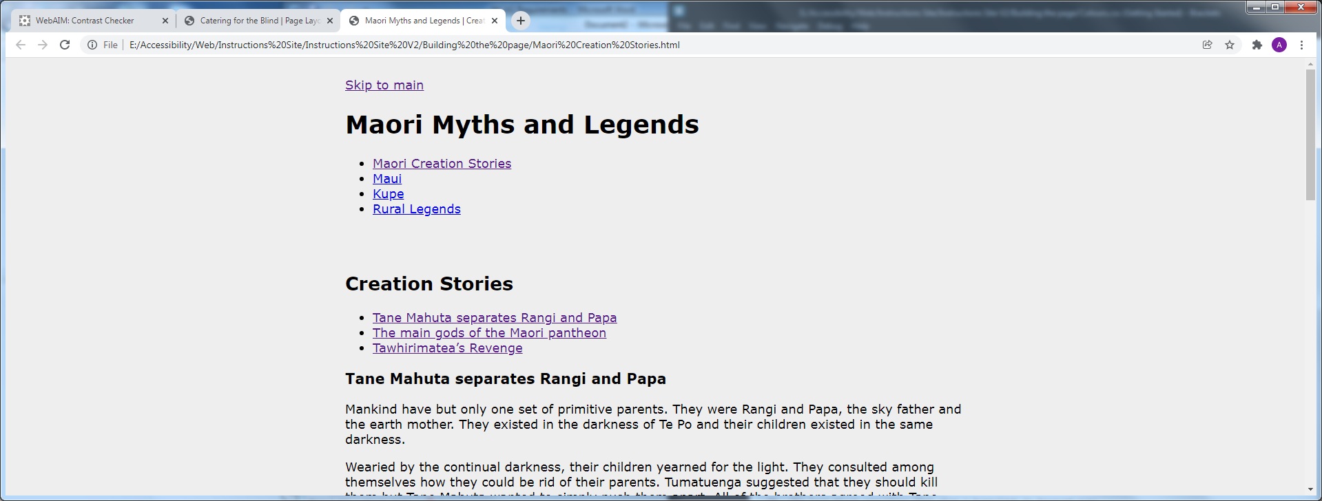
Fig 2: Narrower page width makes it easier to read. Notice that the background is light grey as specified in line 7 of Listing 2.
With our main building blocks settled, let us now look at colouring them.
/*****************************************************************************In this block we specify features that is unique to the <header>, includingits background colour and that its two top corners are rounded.******************************************************************************/header{ background-color: darkorange; border-top-left-radius: 20px; border-top-right-radius: 20px; padding-bottom: 1px;padding-top: 0px; margin-bottom: 0px;}
This block is the easiest to follow. It simply gives the <header> a background colour of dark orange and its two top corners will be curved.
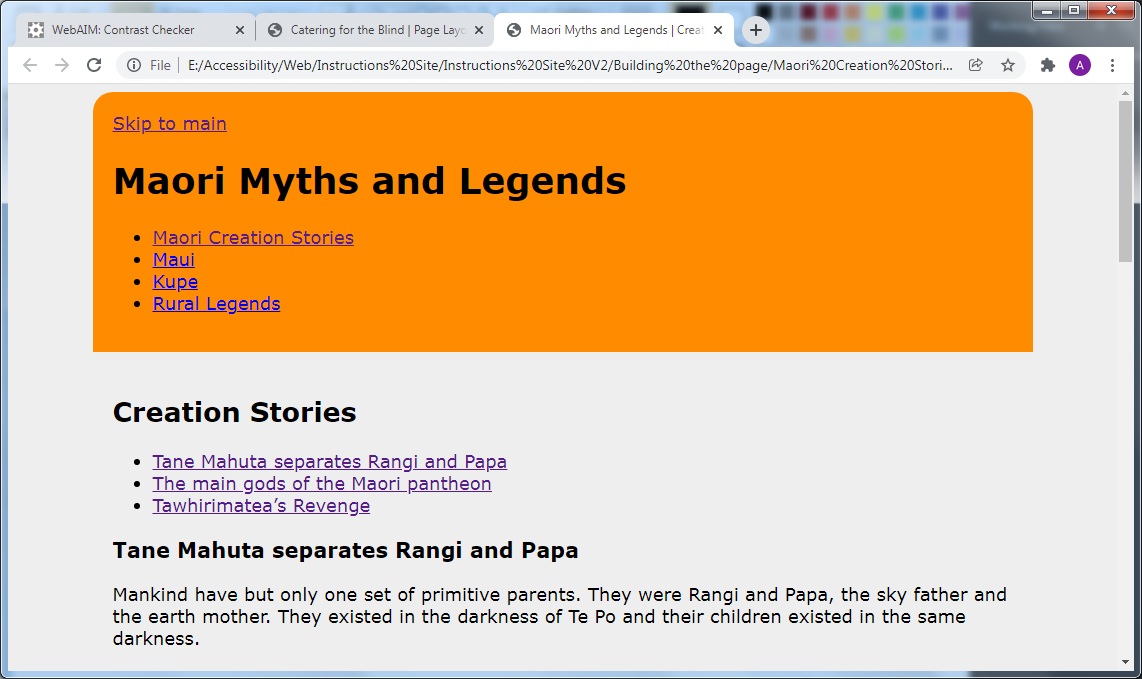
Fig 3: Header area stands out in strong orange.
Looking at Fig 3 above we notice three areas that need tidying up:
The skip link at the very top is visible. This link is there solely for screen readers to read out to the user. A sighted user, however, has no use of it, and for this reason it should be hidden. The simplest way to do this is to give it the same colour as the background
The two top level heading should be centred.
The list of hyperlinks should have the bullet points removed and they should flow horizontally across the page instead of down vertically
The code below does that for us.
Listing 5
/******************************************************************The next six blocks specify features of elements contained withinthe <header> block*******************************************************************/header a{ border-style: none; color: darkorange; outline-color: darkorange;}header a:hover{ border-style: none;}header a:focus{ border-style: none; outline-style: none;}header nav ul,main nav ul{ list-style: none;}header nav ul li{ display: inline-flex;}h1,h2{ text-align: center;}
The effect of the above code is as follows:
Lines 46 - 50 make the top hyperlink invisible:
Line 47 removes the hyperlink text's border
Line 48 changes the text colour to dark orange to blend with the background
Line 49 changes the outline colour to dark orange.
Lines 51 - 53 ensure that the border is still invisible when the hyperlink is hovered over.
Lines 54 - 57 ensure that both the border and outline are invisible when the hyperlink has the focus.
Lines 58 - 60 remove the bullet points from the lists of hyperlinks in the <header> and <main>.
Lines 61 - 63 ensure that the list of hyperlinks in the header flow horizontally across the page.
Lines 64 - 66 centre the headings <h1> and <h2> across the page.
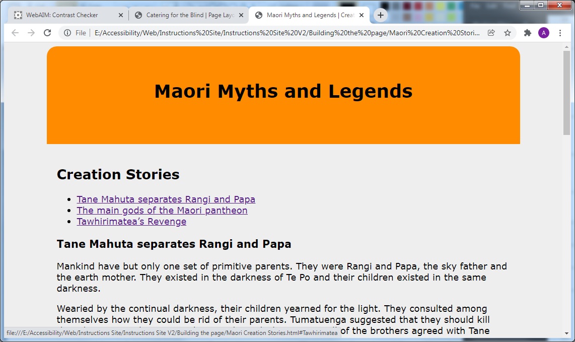
Fig 4 below shows what the page looks like now.
Fig 4: Hyperlinks have disappeared!.
At least we can see that the hyperlink at the top has been hidden and that the <h1> heading is centred. The hyperlinks inside the <nav> block have also disappeared. The reason for this is that lines 46 - 57 not only made the hyperlink at the top of the <header> disappear, they also made all hyperlinks inside the <nav> block disappear.
In the next section we shall bring them back in style.
Here we will be styling the hyperlinks in the two <nav> blocks on the page. We have to do this in compliance with WCAG's criterion 1.4.1 use of colour. To make hyperlinks accessible to people with low vision then two different format styles need to be applied to the hyperlink's text: one for its normal state and another when the user is hovering over it with the mouse. In both cases there must be a minimum contrast of 3:1 between the hyperlink text and the surrounding text.
Listing 6
/******************************************************************The four blocks below control the appearance of the hyperlinks in the<nav> and the <main> block. In the first block the appearance of the linksin the header are specified, while the second block specifies how the samelinks appear when they have the focus or are hovered over. The third and fourth blocks do the same for the group of hyperlinks in <main>.*******************************************************************/header nav ul li a{ color: beige; background-color: #008; padding:5px; border-radius: 7px; text-decoration: none; font-weight: bold; line-height: 1.5rem;}header nav ul li a:hover, header nav ul li a:focus{ color: #008; background-color: beige; text-decoration: underline; border-color:beige;} main nav ul li a{ color: #008; padding: 5px; text-decoration: none; font-weight: bold; line-height: 1.5rem; text-decoration: none; border-radius: 7px;}main nav ul li a:hover, main nav ul li a:focus{ color:beige; background-color: #008; margin-top: 0px; text-decoration: underline;}
In the formatting we did earlier we lost sight of the hyperlinks inside the <nav> block. Our first task right now is to get them back again. Our hyperlinks are not visible because the hyperlink text has been changed to dark orange in line 48 of listing 5. Our job is therefore to change them to some other colour so that they become visible. The code block at lines 74 - 82 does this for us.
The code at line 74 tells us we are going to format all the hyperlink text that is in the unordered list in the <nav> block, which is in the <header> block.
Lines 75 and 76 respectively gives the text a colour of beige and the text background a colour of dark blue - #008. This is providing a high contrast between the text and its background. This makes it easier to read by a person with low vision. The rest of the code tidies up the hyperlinks as follows:
a padding of 5 pixels is added to each piece of hyperlink text
borders of the text block are rounded by giving the border-radius attribute a value of 7 pixels.
at line 79 the underlining of the hyperlink text is removed. (We will be adding it back shortly.)
line 80 changes the font-weight to bold
Lines 83 - 88 control what happens to the hyperlink text when it is hovered over or when the hyperlink receives the focus. Whichever of those two events occur, the change of the text formatting will be the same.
Lines 84 and 85 change the text colour to dark blue and the background to beige, thus reversing the original colours.
Line 86 underlines the hyperlink text - as we stated above - and a beige coloured border is added.
Fig 5: Hyperlinks are restored
Not only are the hyperlinks restored but they also reverse colours when hovered over with the mouse. The hyperlink texts have a colour of beige and a background of dark blue, but the link 'Creation Stories', which is either being hovered over or else has the focus, has a dark blue text and a beige background.
A similar scenario occurs with the hyperlinks inside the <nav> block that occurs at the start of <main>. The initial setup occurs in the block spanning lines 89 - 97.
The initial text colour will be dark blue. This will contrast with the beige background of <main>, which will be set in the next listing. The rest of the block, i.e. 91 - 96 add the same features as we saw lines 78 - 81 doing earlier.
The block that spans lines 98 - 103 controls how the hyperlink texts are formatted when the link is focused or hovered over.
Lines 99 and 100 change the text colour to beige and the background colour to dark blue, thus reversing the original colours. At line 102 the hyperlink is given an underline.
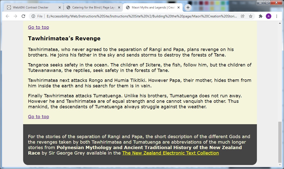
Fig 6:the styled hyperlinks in <main>
Here we see that the second hyperlink stands out from its peers when it is selected. The underlining clearly indicates its role as a hyperlink
/******************************************************************This is main's only unique feature: its beige colour*******************************************************************/main{ background-color: beige;}
Line 108 turns the background colour of <main> to beige.
/******************************************************************The first of the four blocks below specify the background colour of the footer and the fact that its two bottom corners are rounded.The next two specify that its text colour is beige and its hyperlink text colour is yellow.The last block specifies that when a hyperlink is hovered overthe text and background colours are switched around*******************************************************************/footer{ background-color: #444; border-bottom-left-radius: 20px; border-bottom-right-radius: 20px;}footer p{ color: beige;}footer a{ color: yellow}footer a:hover{ color: #444; background-color: yellow;}
This is quite a simple piece of formatting. Lines 119 - 121 set the background colour of the <footer> to dark grey and give the bottom line rounded corners, similar to what we did for the <header>
Lines 123 - 128 change the text colour to beige and the hyperlink text colour to yellow.
For hovering purposes lines 129 - 132 change the text colour to dark grey and the text background to yellow when user hovers over a hyperlink.
We have now laid down our basic colour scheme. The colours we have choses are:
Dark orange for the <header> background
Beige for the <main> background
Dark grey for the <footer> background
Dark blue (#008) for the text of the links in the two <nav> blocks
Other than the above all other text is black
The beige colour was selected since a white background to text may appear too dazzling to a dyslexic.(Dyslexia Website)
WCAG's success criteria 1.4.3 states that normal text should have a minimum contrast of 4.5 : 1. You should not trust your own idea of colour contrast, especially if you have no visual impairments. There are, however, a number of free online colour checkers that you can use.
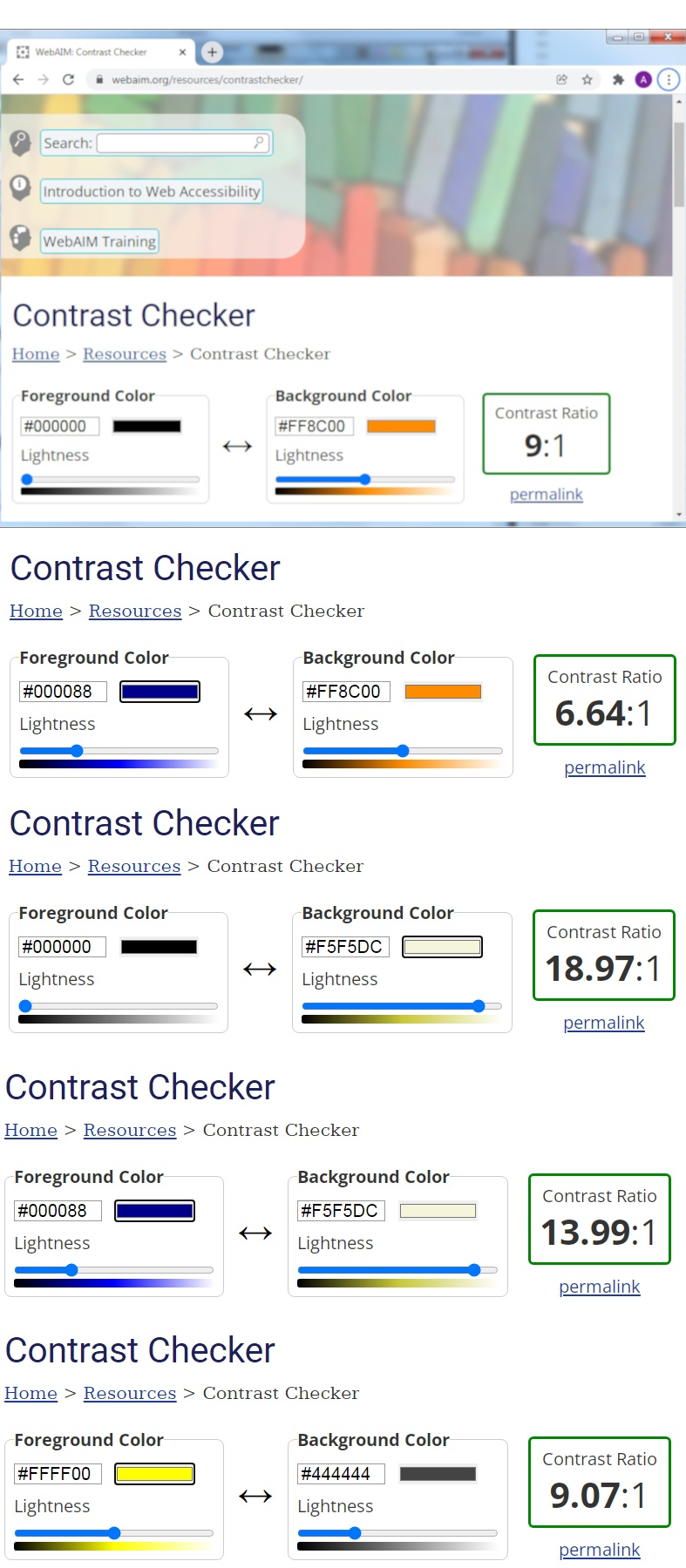
The one demonstrated below is the WebAIM Contrast Checker. As well as having a contrast checker this site also has a good collection of informative, well written and down to earth articles on most aspects of web accessibility.
The image below shows WebAIM's contrast checker at work. It is very simple: enter both the foreground and background colours in the appropriate boxes. As soon as you press the Tab key after the last entry the program will calculate the contrast between the colours for you.
Fig 7
The above set of illustrations shows that when all of the colours were tested against each other, the contrasts varied between 6.64:1 and 18.97:1. This is well above WCAG's Success Criterion 1.4.3 Contrast (Minimum).(WCAG2)
Using liquid layout for our page so that it can display in any window width from 400 pixels upwards complies with this criterion. For more information see the article on the WCAG website Using liquid layout
Here we have put structural and visual order on a web page that previously had no formatting whatsoever.
The <header>, <main> and <footer> blocks had their widths and positions on the page specified jointly since they had those features in common. A fluid layout was applied which allowed their widths confined to the range 400 pixels - 900 pixels.
Regarding colour, a palette of matching colours was created for text, backgrounds, fills and hyperlinks.