A drop cap is a large letter at the beginning of a page of text. It's purpose is decorative. The drop cap may take the space of up to five lines of text as the image below shows.
The drop cap owes its origin to medieval manuscripts where the first letter of a chapter was larger than the rest of the text and was usually sumptuously decorated.
A style that is occasionally used alongside drop caps is to have the first line of text in a different format to the rest of the text. This could mean being in capitals, bold font, different colours or any combination of those. In Fig 1, only the first word is in capitals.
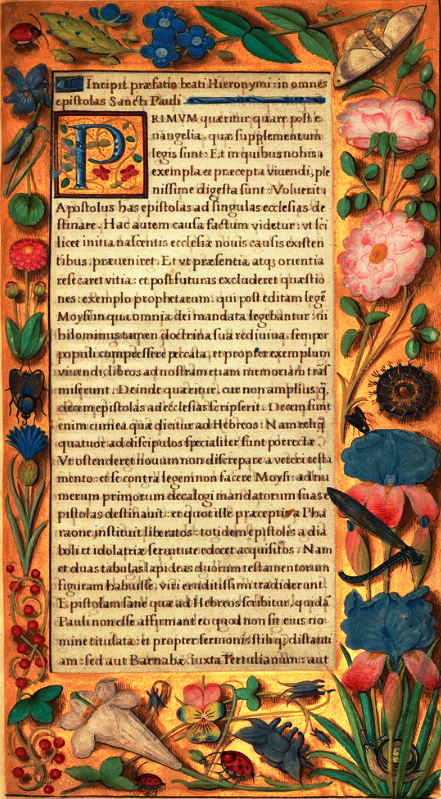
Fig 1: the first page from one of the epistles of St. Paul
Above we have an image of a page from a medieval manuscript which contains the beginning of one of the Epistles of St. Paul.
The decorated drop cap is the letter P. It is the first letter of the word PRIMUM, which means 'first'.
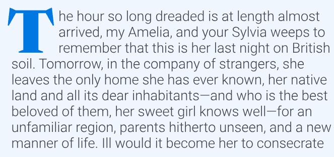
When Gutenberg developed printing the concept of the drop caps continued and is still in current use. Even Google fonts has examples of drop caps, as shown in Fig 2 below
Fig 2: a Google sample of a drop cap
Overuse of drop caps is not recommended and they may have accessabilility issues for some people with cognitive impairments.
On completion of this page you will know how to add drop caps to a piece of text and also format automatically the the first line differently from the rest of the text.
The HTML code below shows two poems that we wish to style to include both drop caps and give different styling to the rest of the text.
Listing 1
<!DOCTYPE html><html lang="en"> <head> <link href="Poems2.css" rel="stylesheet" type="text/css"> <title>Poetry</title> <meta charset="utf-8"> </head> <body> <header> <h1>Poems and Play Extracts</h1> </header> <main> <h2>Skakespeare</h2> <article> <section > <p>Shall I compare thee to a summer’s day?<br> Thou art more lovely and more temperate.<br> Rough winds do shake the darling buds of May,<br> And summer’s lease hath all too short a date.<br> Sometime too hot the eye of heaven shines,<br> And often is his gold complexion dimmed;<br> And every fair from fair sometime declines,<br> By chance, or nature’s changing course, untrimmed;<br> But thy eternal summer shall not fade,<br> Nor lose possession of that fair thou ow’st,<br> Nor shall death brag thou wand'rest in his shade,<br> When in eternal lines to Time thou grow'st.<br> So long as men can breathe, or eyes can see,<br> So long lives this, and this gives life to thee.</p> </section> <section> <p>I know a bank where the wild thyme blows,<br> Where oxlips and the nodding violet grows,<br> Quite over-canopied with luscious woodbine,<br> With sweet musk-roses and with eglantine:<br> There sleeps Titania sometime of the night, <br> Lulled in these flowers with dances and delight.</p> </section> </article> </main> <footer></footer> </body></html>
Above we see the two pieces of text we have to style. Notice that the second piece is not actually a poem but six lines from the play 'A Midsummer Night's Dream'.
There is a fair amount of styling the the CSS code above, but you should be familiar with most of it. The only new styling is from line 49 to 57.
The text here is constructed as a single article with two section elements within it. Each section element contains only one paragraph element.
At line 49 the structural hierarchy points to the first letter within the paragraph.
At line 50 it gives a display of float with a value of left to the first letter of paragraph. This is to ensure that the rest of the lines will wrap themsevles around this letter instead of moving to the line below it.
Lines 51 and 52 increases both the font-size and the line-height of the first letter in order to give it both size and space.
At line 54 the structural hierarchy is transversed again to target the first line of the paragraph. In this case it simply changes the text colour to dark red and the font size to 1.2rem, thus making the first line stand out from the rest of the text that follows it.
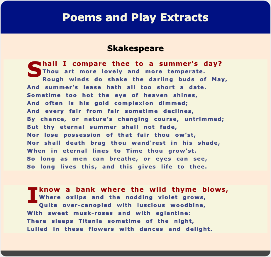
Fig 3: Two poems by Shakespeare
Above we see the result of our styling. Notice that even though we did not specify the colour of the drop cap in lines 49 - 52, it has still taken on the colour of the first line.
The uploaded file focuses on the concept and implementation of decorative elements in text, specifically drop caps. It begins by explaining the historical origins of drop caps, which date back to medieval illuminated manuscripts. These manuscripts often featured large, sumptuously decorated letters at the start of chapters or important sections, combining artistic flair with textual content. The file highlights their continued use in modern contexts, including digital platforms, as a means of enhancing the visual appeal of text.
The document provides examples of drop caps, including a page from a medieval manuscript showcasing the decorated letter 'P' at the start of the word 'PRIMUM.' It also illustrates how modern tools, such as Google Fonts, incorporate drop caps into design, offering a bridge between historical and contemporary typography. However, the file notes the potential accessibility challenges posed by drop caps, particularly for individuals with cognitive impairments, and advises caution against overuse.
The file includes a practical guide for creating drop caps using CSS. It demonstrates how to style the first letter of a paragraph with increased font size, line height, and floating properties to create a visually distinct and decorative element. Additionally, it describes how to style the first line of text differently, using color and font size adjustments to emphasize its importance. The examples feature excerpts from Shakespeare’s works, such as a sonnet and a passage from 'A Midsummer Night’s Dream.'
Finally, the document references external resources for further exploration of drop caps and their accessibility considerations. These include the Accessible Publishing Knowledge Base and Smashing Magazine, which provide insights into historical use and current best practices. Overall, the file combines historical context, practical application, and accessibility awareness to offer a comprehensive guide to decorative text styling.
The purpose of this assignment is to help students demonstrate their understanding of the historical, stylistic, and technical aspects of decorative text elements as outlined in the uploaded document on CSS decoration. By exploring the concept of drop caps and their implementation, students will synthesize historical context, accessibility considerations, and technical knowledge into a cohesive narrative.
To complete the assignment, students are required to reflect on the origins of drop caps, tracing their evolution from medieval illuminated manuscripts to modern digital typography. The document offers a comprehensive guide, showcasing examples from historical texts, such as St. Paul's epistles, to contemporary applications, including Google Fonts. Students should analyze these examples and explain the aesthetic and functional significance of drop caps in enhancing text presentation.
In addition to the historical and visual aspects, students must discuss the practical CSS techniques detailed in the document. This includes explaining the use of specific CSS properties, such as float for wrapping text, and selectors like ::first-letter and ::first-line for targeted styling. Emphasis should also be placed on understanding how to achieve balance in design, avoiding overuse, and addressing potential accessibility issues.
The assignment will conclude with students summarizing how the principles and techniques covered in the document could be applied in real-world scenarios. They are encouraged to provide examples, either hypothetical or derived from existing works, to illustrate their understanding of combining decorative elements with practical functionality in text design.
By crafting their responses in a narrative style, students will not only demonstrate comprehension but also practice articulating complex technical and aesthetic concepts in a clear and engaging manner. This aligns with the broader goal of integrating historical context and modern design principles into web development education.